
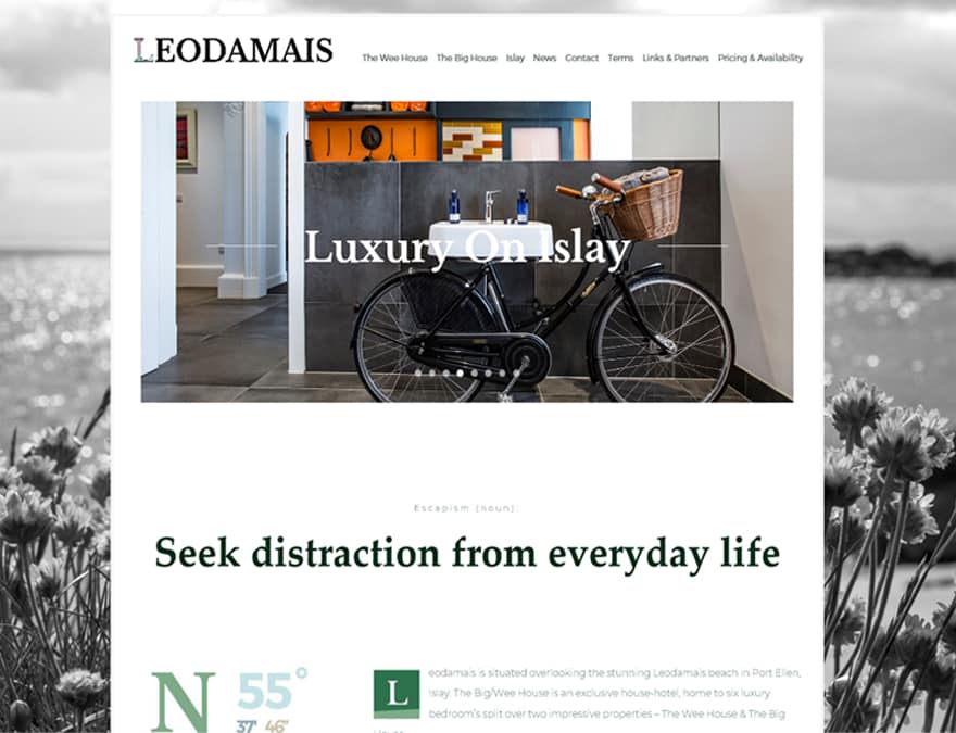
The branding for Leodamais House was designed around the unique location on Islay, and the tagline “Luxury on Islay“.
Logo Design
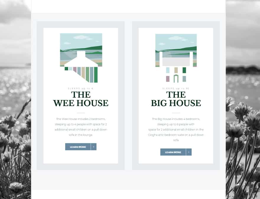
The property, split into two sub houses, were each given a logo which features the elevation of the house picked out in negative space against the bay over which they each look.
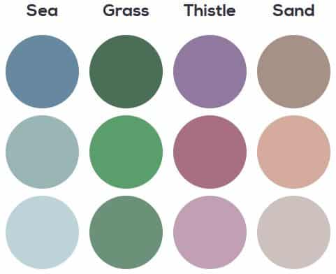
Color Selection
The colours were chosen carefully to reflect Islay’s natural beauty, and the landscape constructed from geometric shapes to maintain simplicity to the logo.
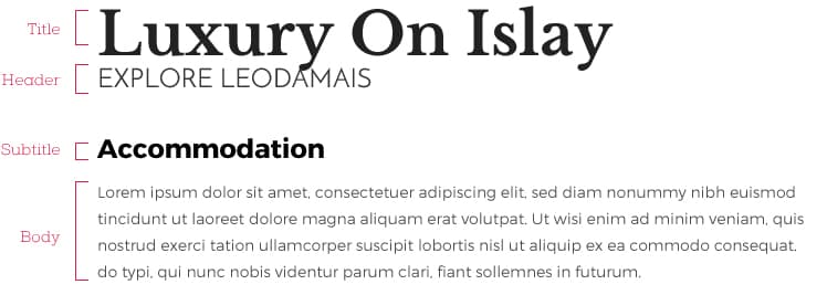
Typography
I chose the fonts to reflect the brand’s luxury target market and high-quality renovation of this holiday home. A traditional serif font for headers contrasts with a more modern geometric font for body text.
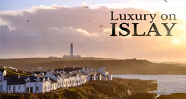
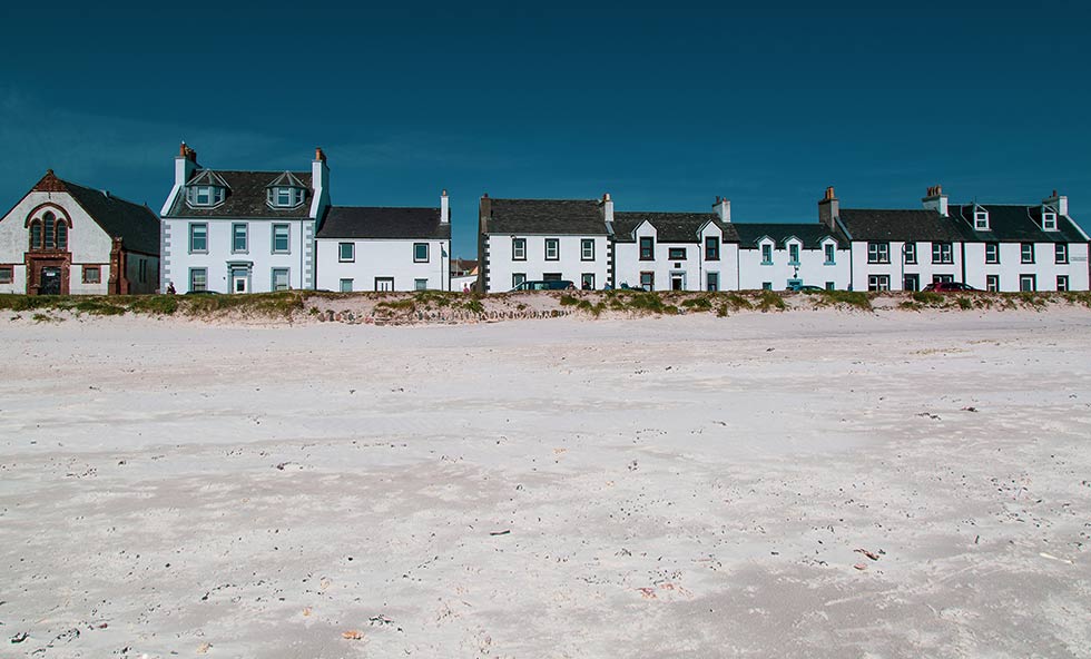
Photography
I created a brand guideline booklet which outlined the formula for the brand, including logos, fonts, colours and use of photography.
Homepage
Self Catering Properties
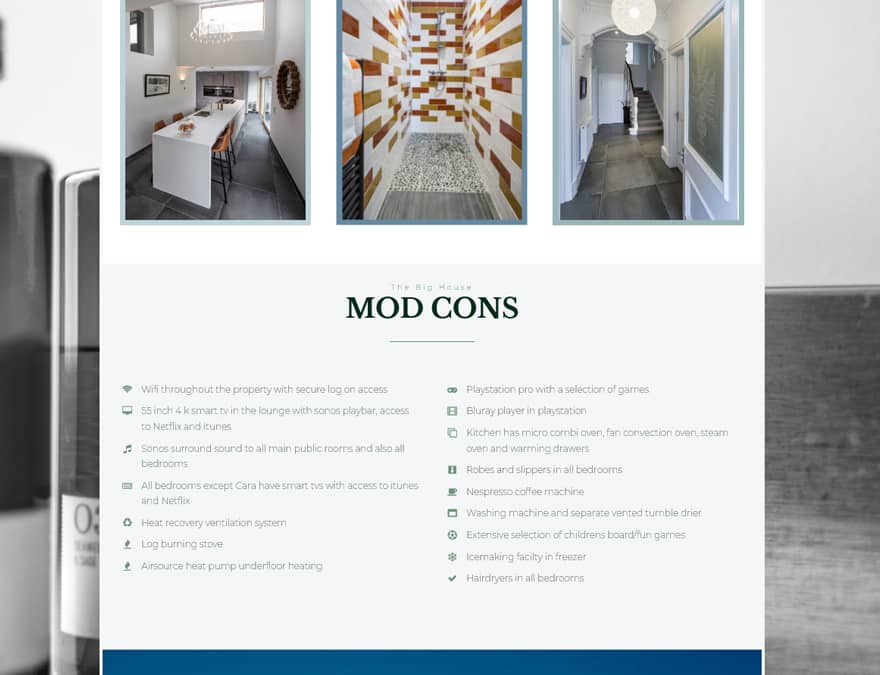
House Features
layout
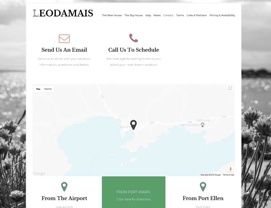
Contact & Booking
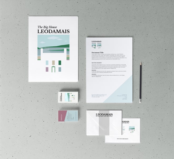
📃 Branded Stationery
Design Hero provided design for a range of branded stationery including:
- Letterheads
- Compliment Slips
- Business Cards
- Adverts & Flyers
- Promotional Posters
- Welcome Packs
- Seasonal Marketing
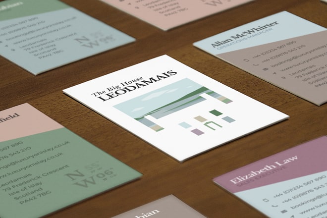
📇 Business Cards
The front of the business cards used the negative space from the logo to great effect.
On the reverse, I made an unusual decision to do several versions.
various versions of the card used different colours from the brand, representing the Scottish Isles.
Standard size, premium spot UV finish with gloss highlights finish
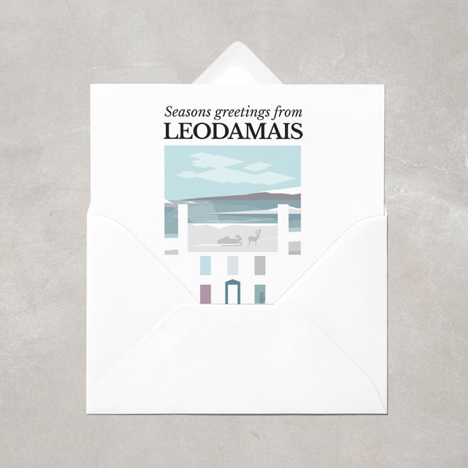
📅 Seasonal Greeting Cards
I created branded Christmas cards with fun plays on the logo to create a winter scene.
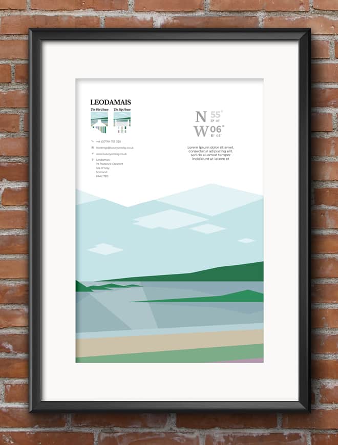
🎴 Event Posters
I created promotional posters and flyers to advertise the house through print and digital mediums.
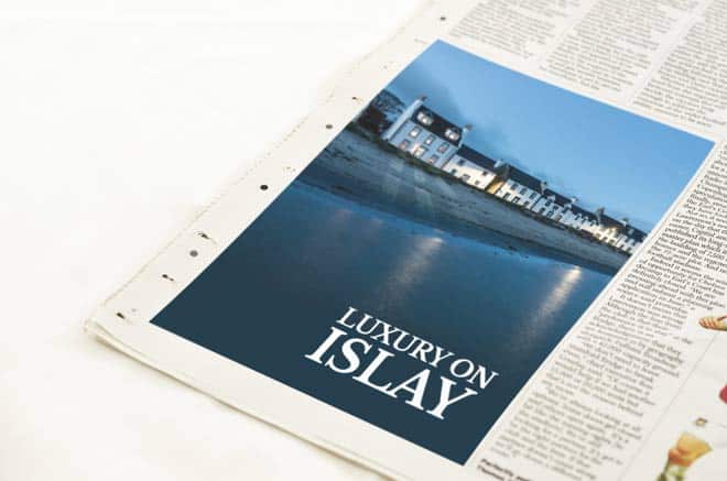
📰 Magazine Advertisements
I also created adverts which were published in various online and printed magazines, newspapers and publications to promote Leodamais across a range of platforms.
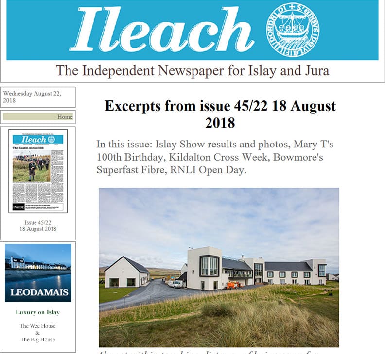
📰 Local Advertising
I designed the ad to work online, as well as in print, specifically for the local authority on news and updates for Islay, “the Ileach”.
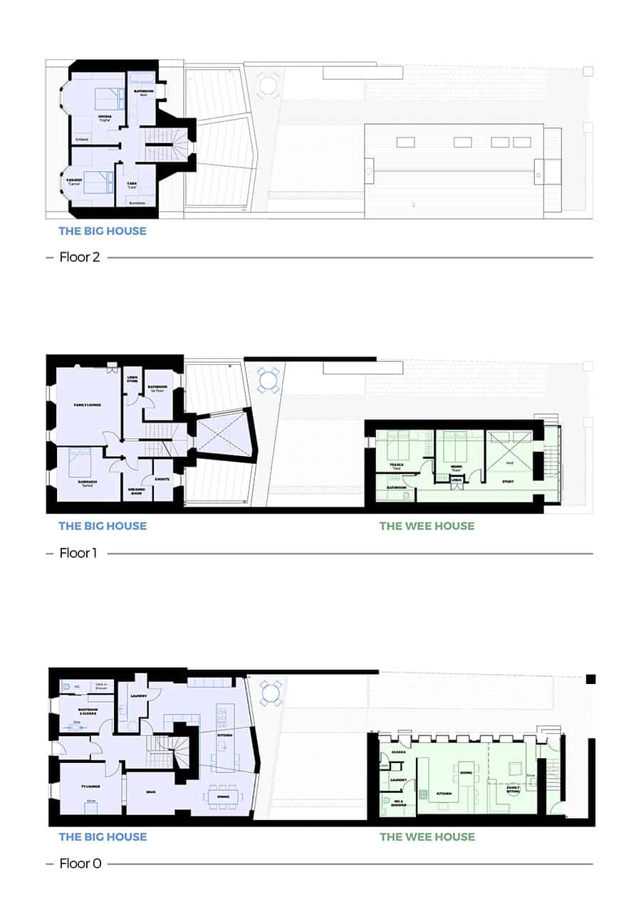
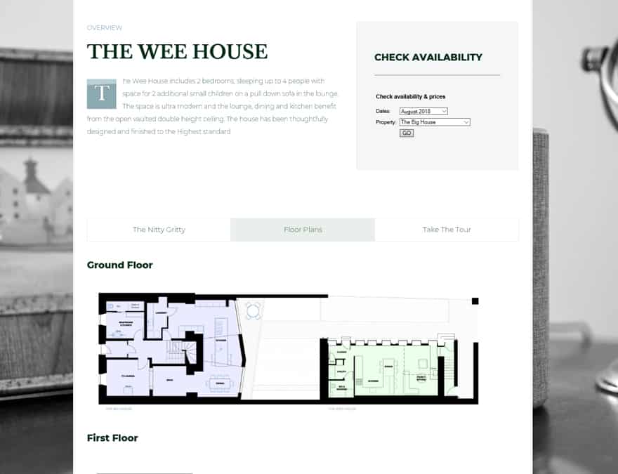
✍️ Floorplans
I helped Leodamais by customizing the floorplans for the holiday house, and detailing the layout for the property in a custom illustration