Branding and website design for a holiday park in Scotland
A brand design and website for holiday destination in Scotland

The Mission
Services provided
Project Sectors
Visit Site
https://www.clochcaravans.co.uk
The Strategy
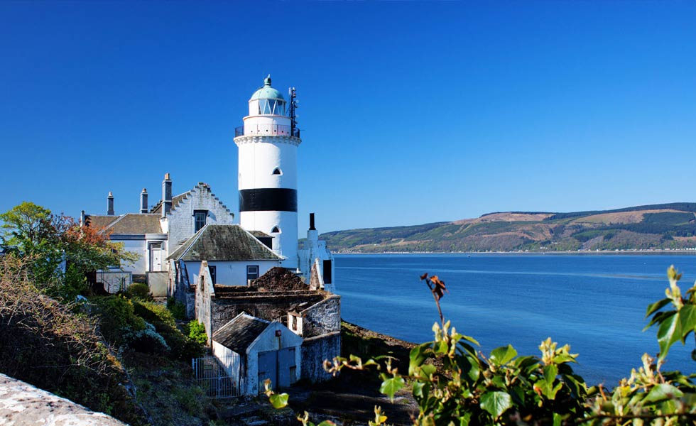
Cloch Caravans is a family run caravan park operating on the West coast of Scotland with stunning views overlooking the River Clyde. The holiday park caters to residential and holiday caravans and is situated on the hills behind the iconic Cloch Lighthouse from which the park derives its name.
I was asked to rebrand Cloch Caravans to increase brand recognition in Inverclyde and Argyll & Bute, redesign road signage to draw attention to the park and develop a new holiday website to showcase the scenic views and nearby attractions to the park.

Brand Strategy for Cloch Caravans
Cloch Caravans branding had been in need of revisiting, and hadn’t been changed in over 20 years.
The brand looked dated, so I wanted to use 20 years of heritage, but refresh the brand for a holiday park, to improve visibility, and a more modern market.
The centre of the branding exercise was the attractive location of the park, the focus of which was the scenic views and the relationship to the Cloch Lighthouse.
Logo Concept
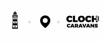
The logo combines the iconic lighthouse with a location marker, representing Cloch Caravan Park as an ideal holiday destination website.
Logo Design
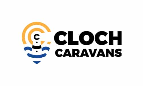
The final logo achieved a pleasing balance, and the iconic lighthouse is clearly recognisable.
Logo grid
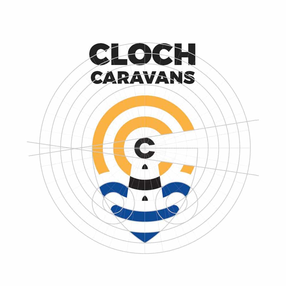
The carefully considered circular grid was key to the balance in this logo design.
As a final flourish, a small gap was cut into the marker, to echo the C from Cloch Caravans.
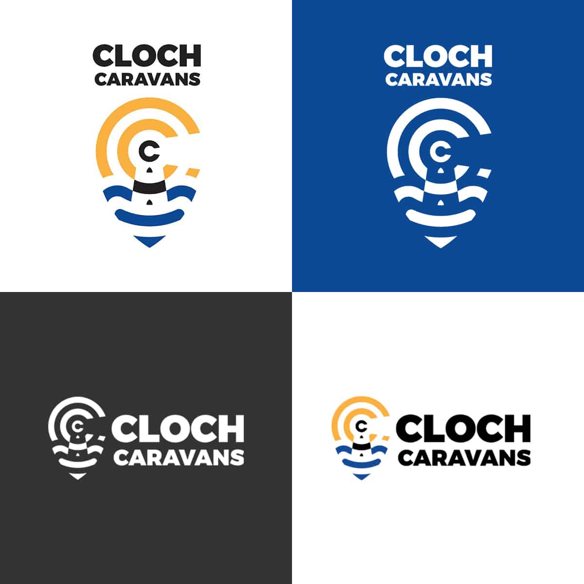
Logo formats
The logo was reproduced digitally for use in a variety of formats.
Logo Use
The final logo had to have a visual impact on all mediums including print and web, and on full photo backgrounds.
Websites for Holiday & Travel
The Website for Cloch Caravans was in need of a refresh.
I suggested that a new website for a travel company was required, built from scratch to future proof the business.
The site was designed around the Cloch Caravans brand presenting information to potential customers such as caravan specifications, local events of interest, prices, terms & conditions etc. This enabled Cloch Caravans to reduce time spent dealing with enquiries and promote the presence of the caravan park online.
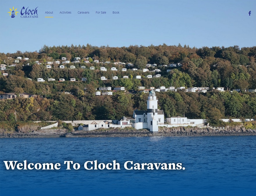
Homepage
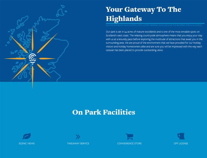
About
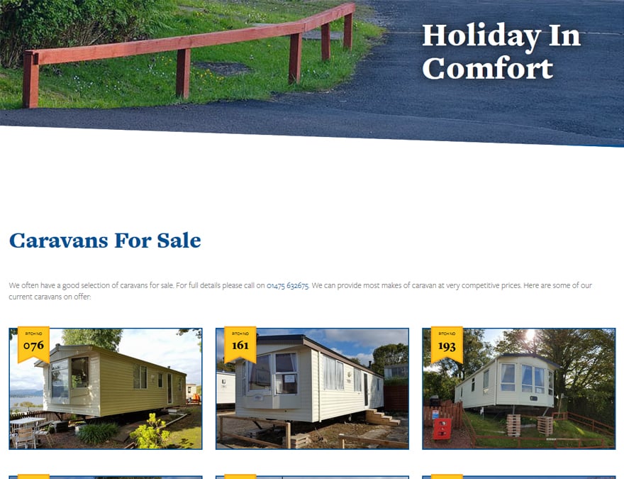
Caravan Sales
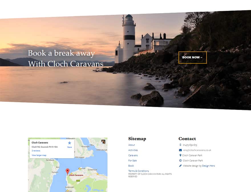
Book Online
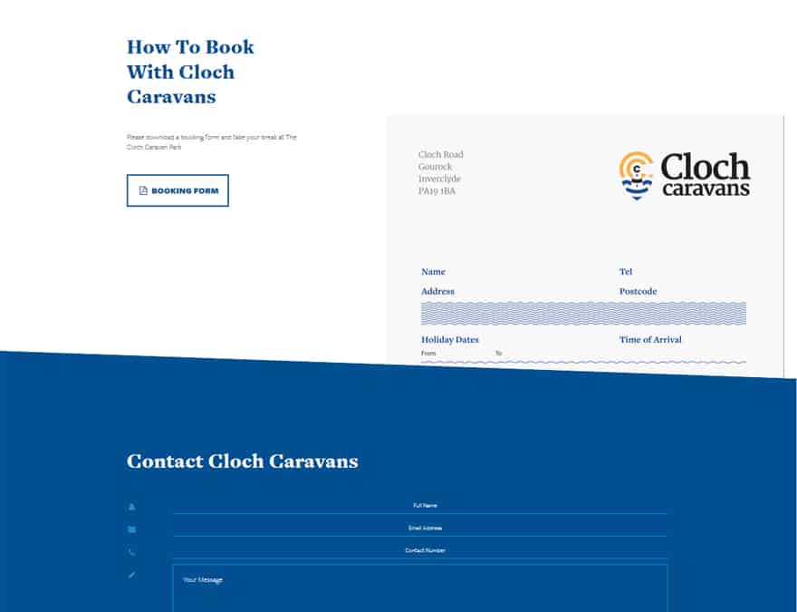
Contact
Here's what Cloch Caravans says about working with Design Hero...
We have used nick to redesign our old website for our holiday park and brought it up to a fresh new standard it’s also very helpful to have a real person to talk to regarding updates.
We’re really pleased with the branding design he did for us, it was exactly what we were looking for.
If there were to be any problems they have been fixed within an instant.
Ready to take your business
from zero to hero?

