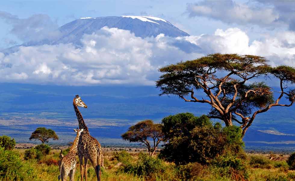
A brand designed for a charity national park
A charity brand design to inspire the community to look after their national park


The Mission
Services provided
Project Sectors
Location
Kilimanjaro, Africa
The Strategy
I had worked with Peter before for the Kilimanjaro Climbing Company on a new design of brand identity and brochure design and printing service.
Peter now asked me to return and work on an independent brand identity for the Kilimanjaro Mountain Trust charity in Africa.
The Kilimanjaro Mountain Trust is the charitable arm of the Kilimanjaro Climbing Company. The aim of the Trust is to raise money through charitable means that can be distributed to organisation that either has an impact on the lives of the people who work on Kilimanjaro or have a beneficial environmental impact to Kilimanjaro or its surrounding area.

Brand Strategy for Kilimanjaro Mountain Trust
The KMT’s brand identity had to be totally separate from the KCC’s and so I started afresh by looking at a new design for a travel agency with Kilimanjaro Mountain Trust’s ethos and beliefs.

Logo Concept
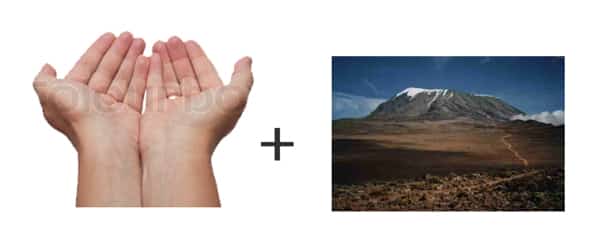
The idea of sharing the mountain in a mutually beneficial and non-destructive way led to the concept of a pair of hands, offered palms upwards a sign of sharing and trust. The silhouette of these hands take the form of an iconic view of Kilimanjaro framed by the setting African sun.

Final Logo

Color Selection

Typography
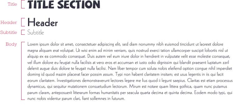
The fonts I used for the KMT had to be distinctly African but also friendly and thoughtful to represent the charitable side of the Trust.
Two fonts were used: one for the logo and another for headers and body text for increased legibility. Guidelines for font weights and proportions were given to create structured and stand-out typography for the brand.
Here's what Kilimanjaro Mountain Trust says about working with Design Hero...
Design Hero visually captured everything the charity represents in the design of the logo.
Great work Nick!
Ready to take your business
from zero to hero?

