
I provided brand identity services with a logo design for Stoodatours.
Logo Design
The final logo is a map showing a tour route along a riverbank sitting atop a graduate’s hat. The logo was designed to be multi-faceted in its meaning; the hat suggests the student demographic; the mountains and water as the sights and opportunities to be had in web designer for Argyll & Bute; and the road as the tour routes.
The final logo can be used with or without the Tagline and is also provided in Grayscale format. The logo should be used on a white background whenever possible, though it will also work on pale and dark background colours or Photography.

Color Selection
The colour scheme is designed to be exciting and appealing but also thoughtful and informative, in keeping with the targeted student tour market. The use of gradients has been used to add depth and flexability. These colours can be used for taglines or promotional slogans as well as photography, and promotional materials.
Font Selection
The font used for Stoodatours is playful, fun, and thoughtful. The font is used according to strict proportions in order to preserve the hierarchy of the typography. I set out the brand identity in a brand guidelines document and presented it to Stoodatours for reference
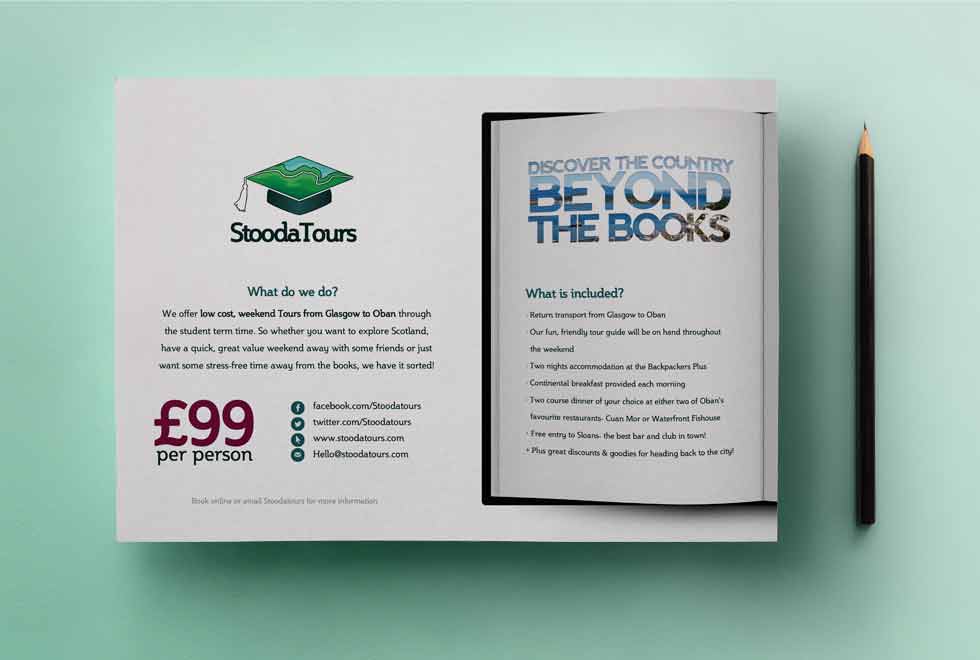
🎫 Flyers
Design hero designed a flyer advertising Stoodatours’ value getaways for students. The flyer features a cropped book with an image of Oban punching through the text in the company’s slogan. This imagery the hidden gems waiting to be discovered when the students venture out into Argyll & Bute to explore their own country.