
The brand was built around the tagline which Allan provided:
“Luxury on Loch Lomond”
The logo was designed to convey the quality of the accommodation, as well as the breathtaking views and peaceful environment on offer.
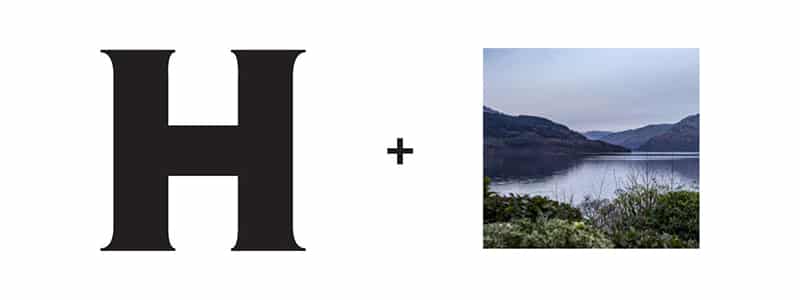
Logo Concept
The logo was built around the panoramic view of Loch Lomond from the house, combined with the letter H from Hollybank
Logo Design
The final logo was a beautiful sunset view from Hollybank House, framed within the titular letter H
Final logo design
I created version of the logo for use in various formats including web and print.
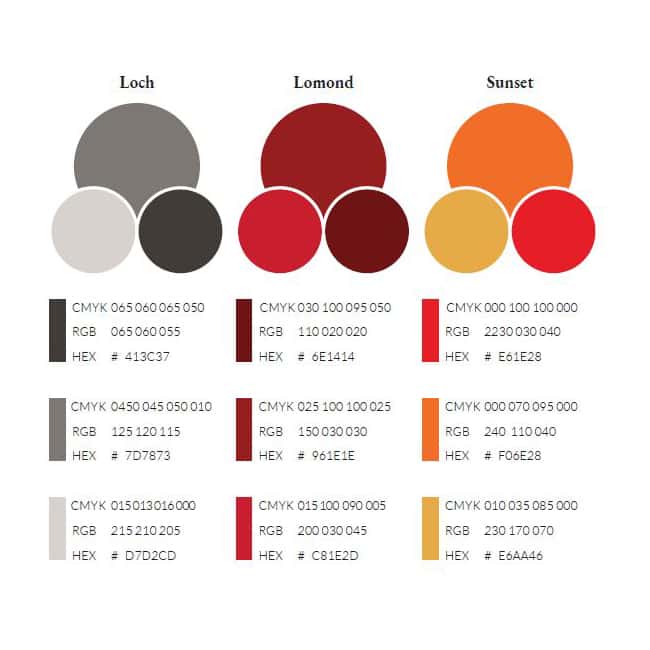
Logo Grid
I carefully managed the grid brought balance to the logo
Typography
I chose a colour scheme directly from sunset photography taken around the self catering accommodation.
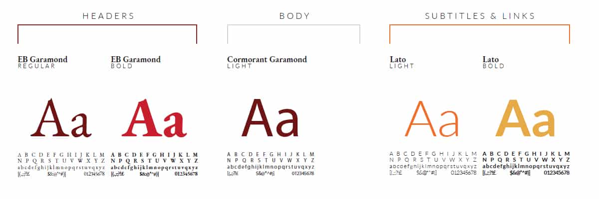
Typography Selection
The typography uses a serif font to establish a luxury feel, with sans-serif sub headers for a modern twist.
Brand Application
The brand was applied across every touchpoint, in one of the most comprehensive, and meticulous branding applications I have had the pleasure of working on.
Application of Branding
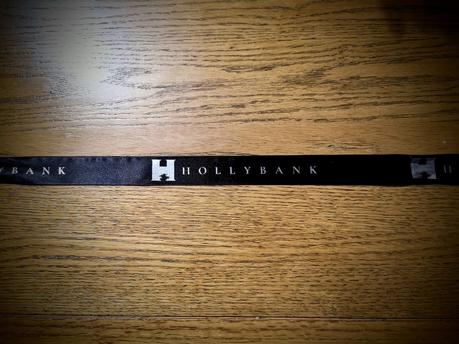
We used the branding on signage, window films, decorative ribbons, on tvs and documentation.
Application of Branding
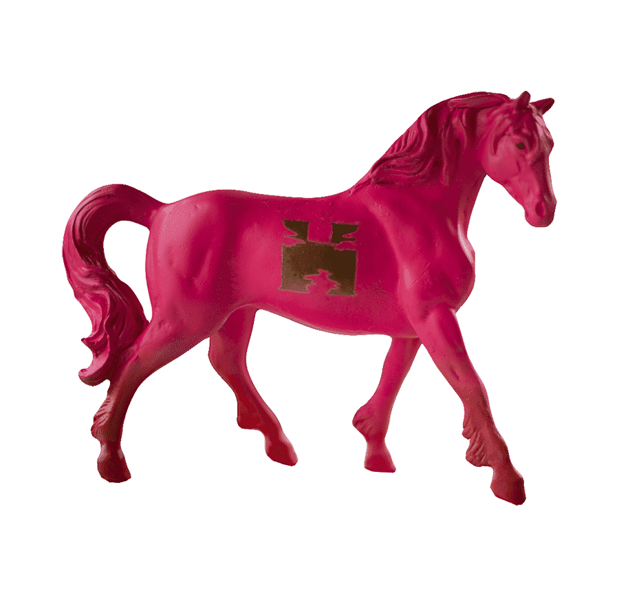
We even applied the brand to this horse!
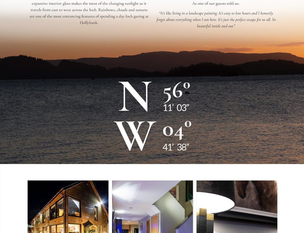
Professional Photography
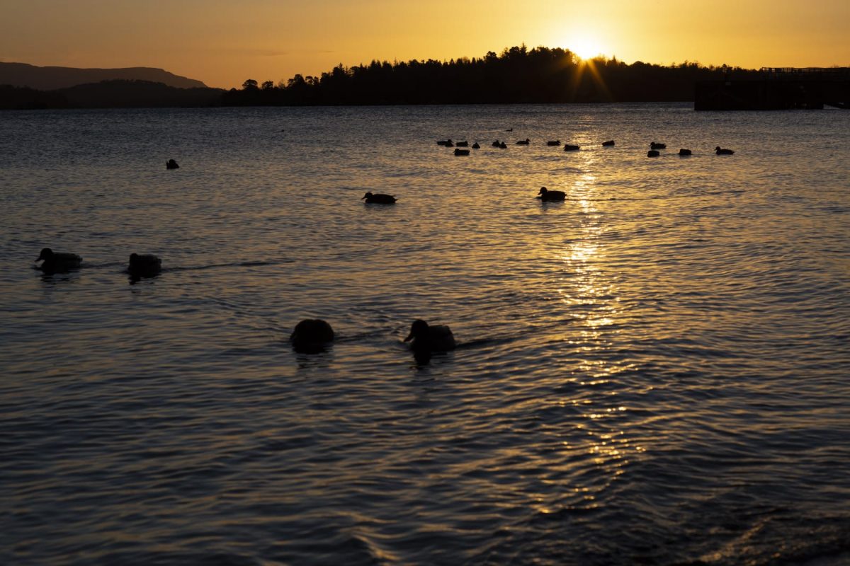
For this design project, Harrison Reid at Photography Everything who provided professional photography for the entire project.
His services were simply amazing and he perfectly captured what makes Hollybank House so special.
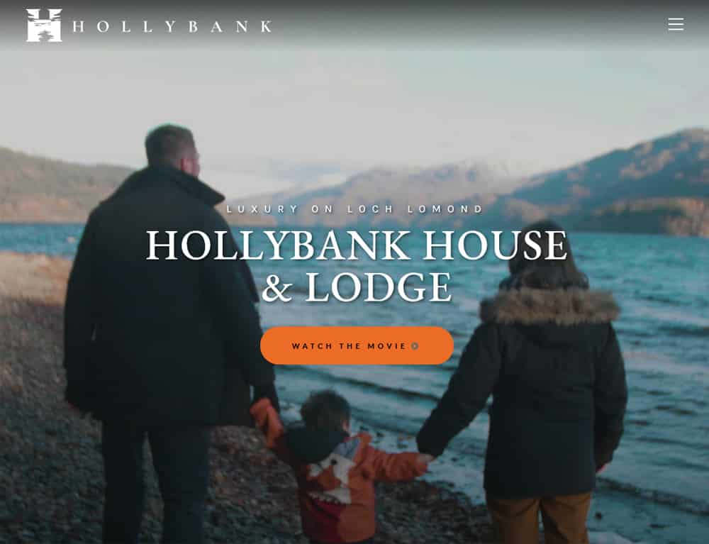
Video integration
Integration of full screen media such as video to truly immerse the user in the Hollybank experience.
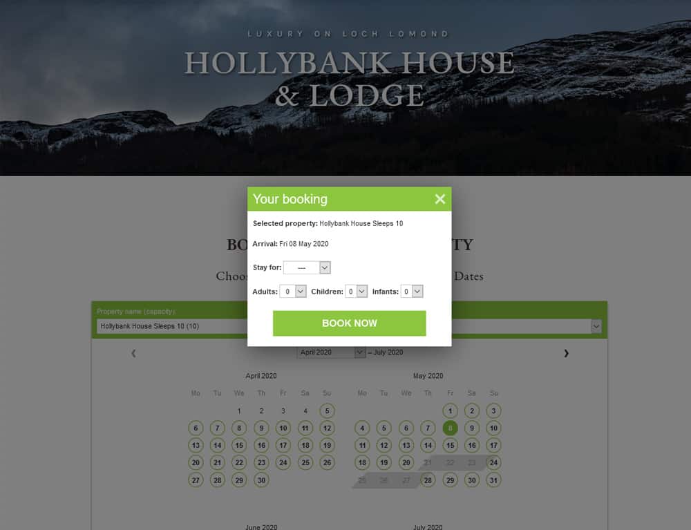
Bookings
It was vital that guests could seamlessly check dates, and book their holiday online through the website.
We used a system called Supercontrol, which I integrated into the site so that the Hollybank team could manage their own bookings from an easy interface.
Graphics & Imagery
I created a number of stunning illustrations and custom graphics for the website to help promote the next level of luxury at Hollybank, and impress potential guests with the value on offer.
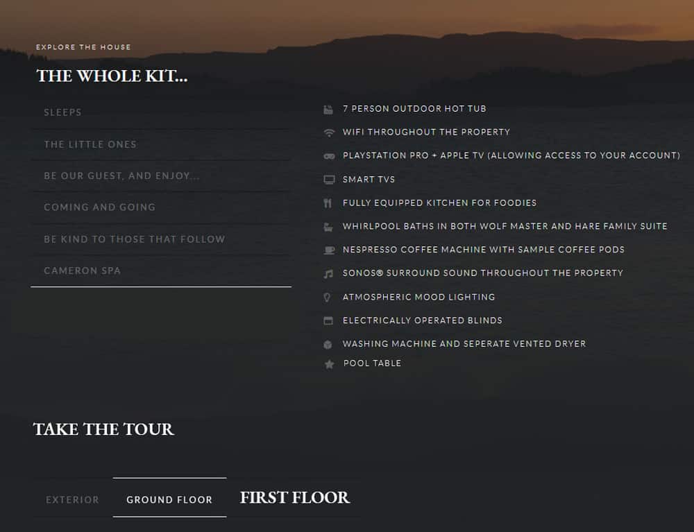
Accommodation Features
For each property I created a unique page packed with vital information about the self-catering accommodation, so that guests were well informed about the level of quality on offer at Hollybank.
Strong photography helped here to showcase the care and attention detail Allan and the team had taken in outfitting the holiday properties.
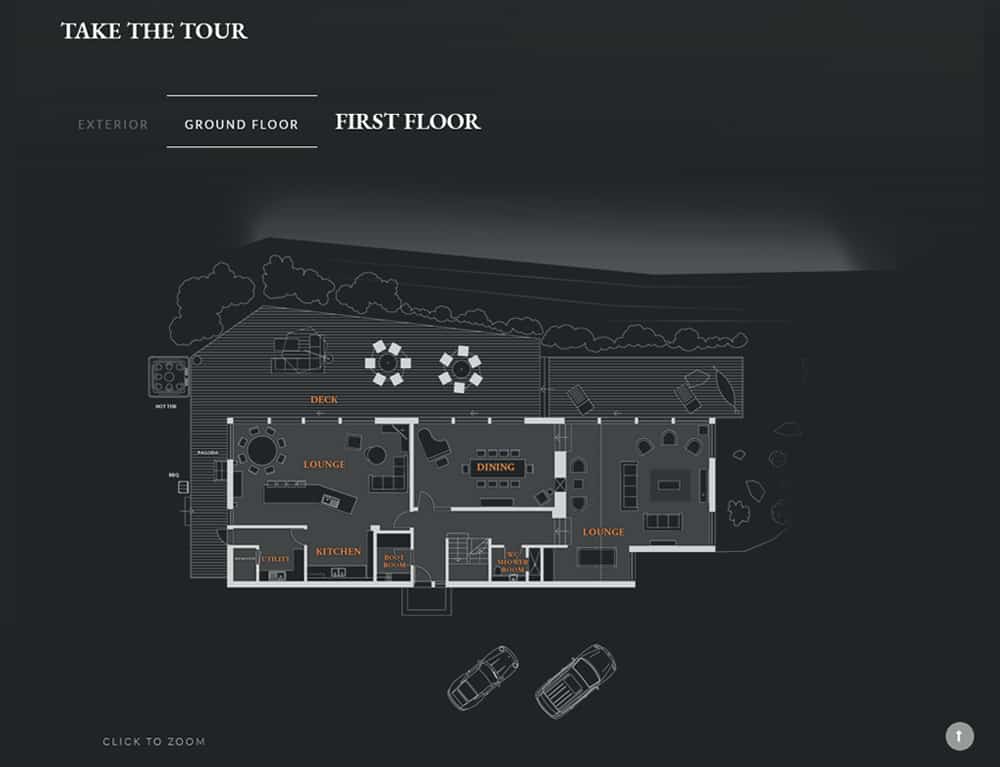
Plan your Visit
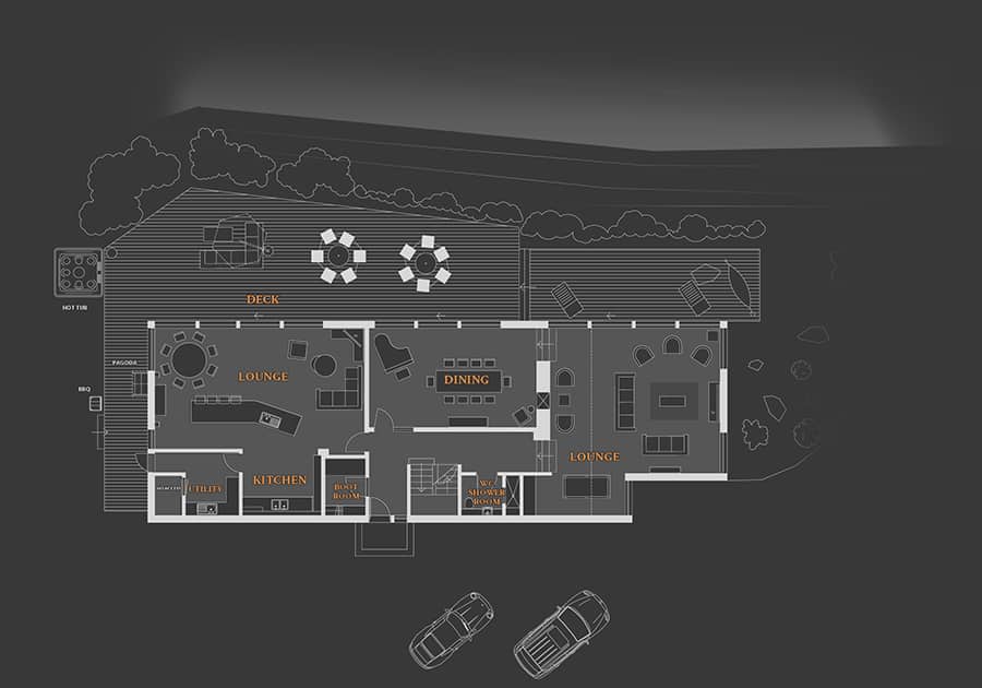
I fell back on my previous experience as an architect to develop and illustrate floorplans of both properties, to help guests appreciate the architectural design of the house.
Guest Reviews
Guest testimonials were very important to the marketing process for Hollybank. I integrated guest reviews into the booking website to help build trust for potential guests.
News & Events
I set up a post type so that the Hollybank team could add their own events, and posts with lots of things to do in the surrounding areas. This helped their guests plan their visit in advance, and also led to lots of marketing opportunities to tie in with local suppliers.
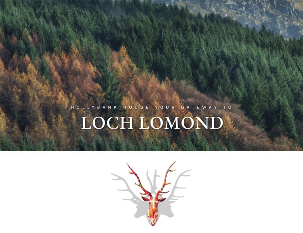
Local Area
I set up a page where guests could explore the rich local area of Loch Lomond.
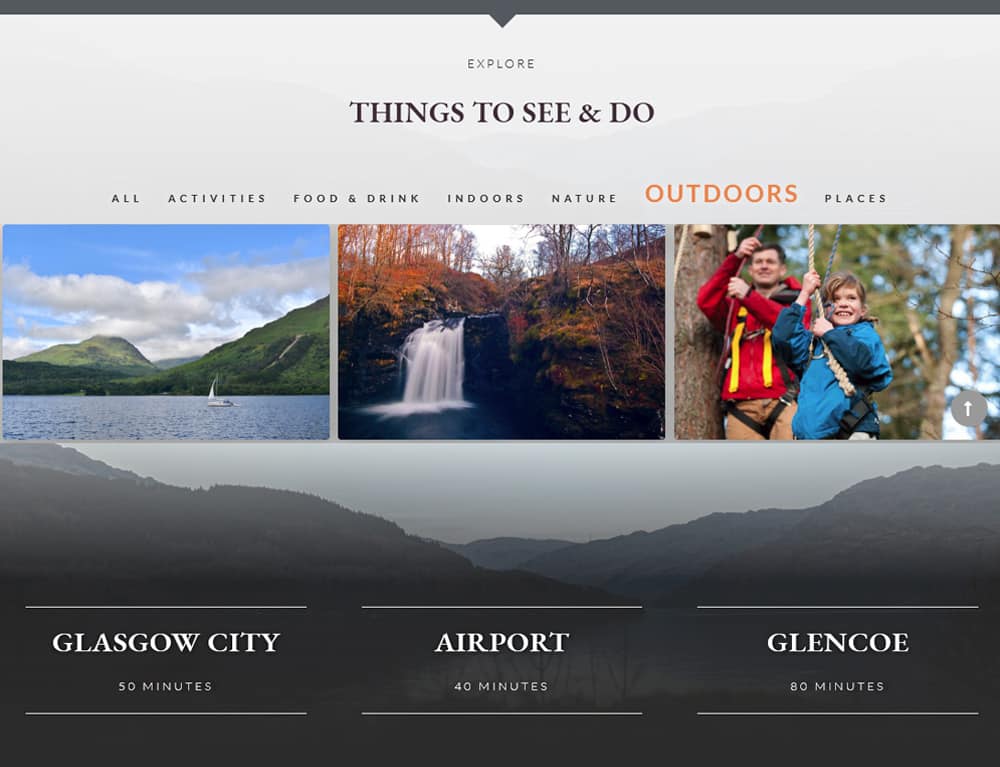
Things to Do
This page was full of local heritage, and suggestions which allowed the Hollybank Team to tie in with local business for marketing opportunities and affiliate sales.
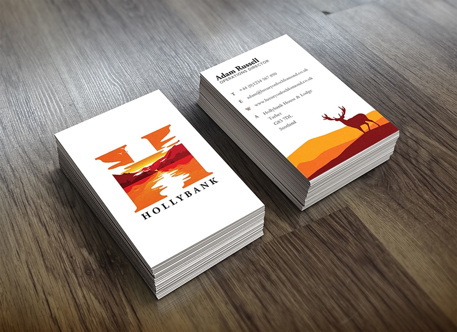
📇 Business Cards
For the business cards I used the same illustrated style as the logo with classic Scottish scenes illustrated on the reverse.
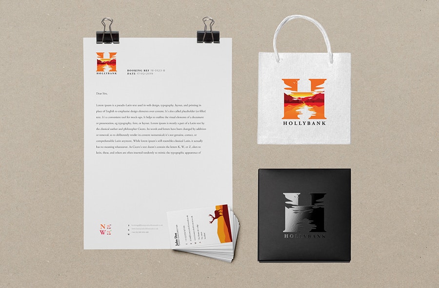
📃 Branded Stationery
I applied the brand throughout various branded stationery and business letterheads, welcome packs etc. so that guests were given the full effect of the branding during their visit.
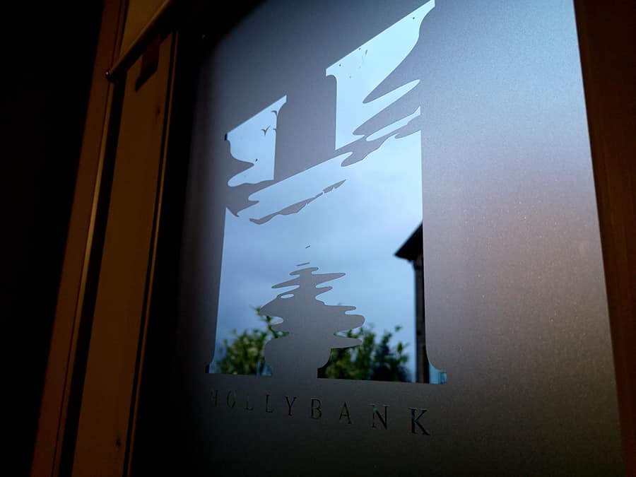
🌇 Branded window film
The negative space around the logo was used to create a dramatic first impression with window decals and film on the front door to each property.
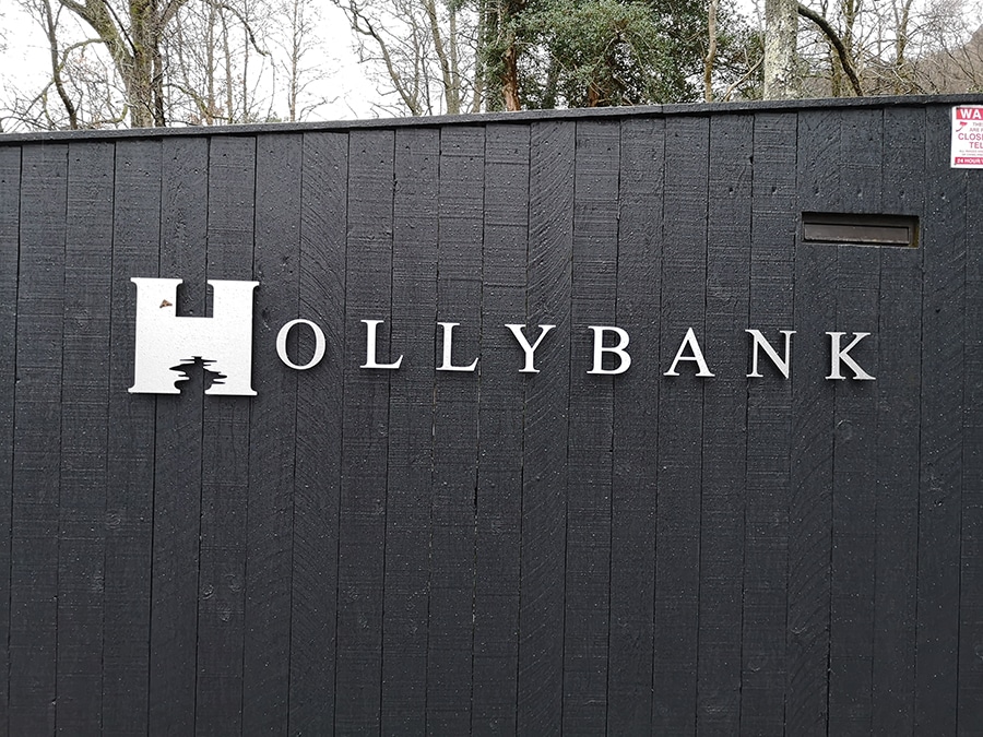
🌟 Branded signage
The logo looks particlarly striking in stainless steel signage for the entrance gate, one of the first encounters guests will have with the brand at Hollybank.
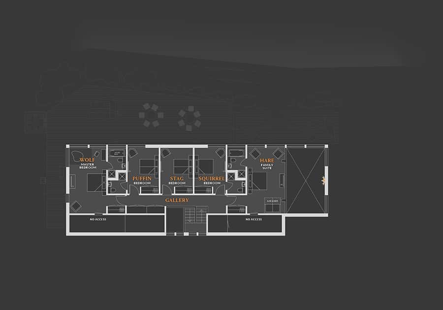
✍️ Custom floorplans
I had the opportunity to dust off my old architect hat, and illustrate floor plans for the properties.
✍️ Custom floorplans
The custom floor plans allow guests could plan their visit in advance.