
COVID-19 has completely disrupted many small businesses.
I’ve recently worked with Julie Duncan from The Badass Rules in Greenock, who has built a huge following for her business offering a positive mindset paired with life and fitness coaching.
Julie is a shining example of how to turn a negative into an opportunity:
What Glow Getter did
I have worked with Julie before to build a blogging website for The Badass Rules.
During lockdown, she found herself unable to operate the gym part of her businesses and pivoted to growing a new part of her business.
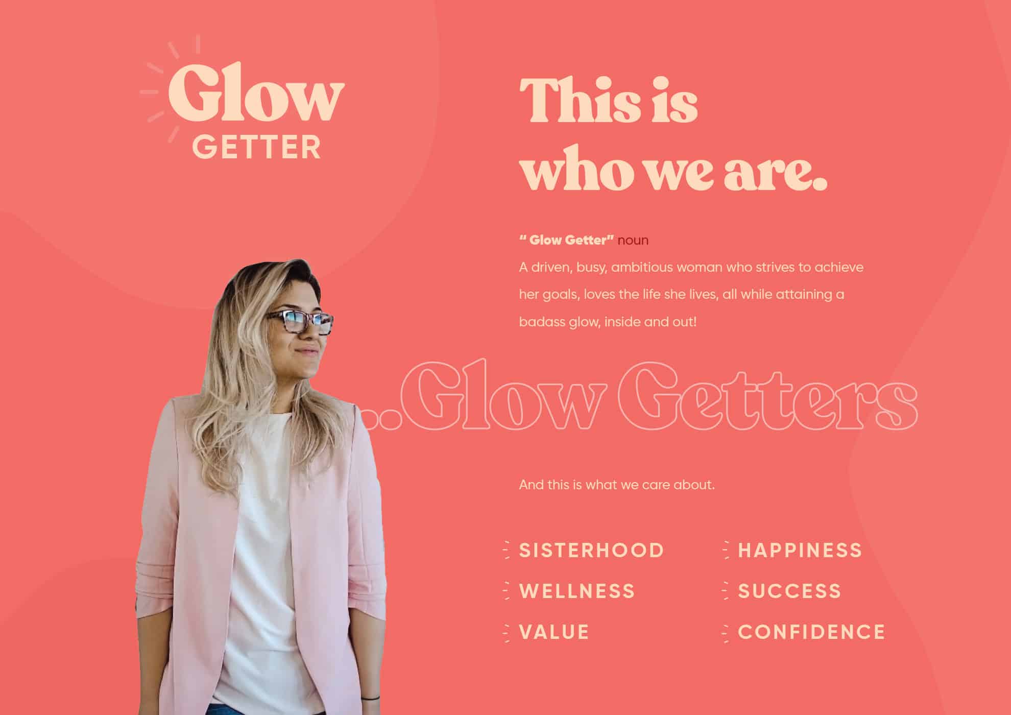
GlowGetter is a reincarnation of sorts for The Badass Rules, with a renewed focus on professional coaching for ambitious female entrepreneurs.
GlowGetter is a new brand aimed at ambitious women looking to improve both mental and physical health, with a coaching platform through Instagram marketing, virtual coaching and live video training.
Her new business shuffle has seen a radical shift and as a result Julie knew she needed to rebrand to focus on her target customers of professional, ambitious women.
She has now fully pivoted her fitness gym business into an online coaching platform and invested in a new membership website to serve her coaching packages.
This is a brand which will live on mobile, and on social media in particular.
The brand conveys everything that GlowGetter stands for:
It’s bold, confident and unconcerned with the status quo.
More than anything it’s a symbol for a community of like-minded women who want to succeed and feel better about themselves.
Here’s how Julie and I built the brand:
Logo Grid
The Brand
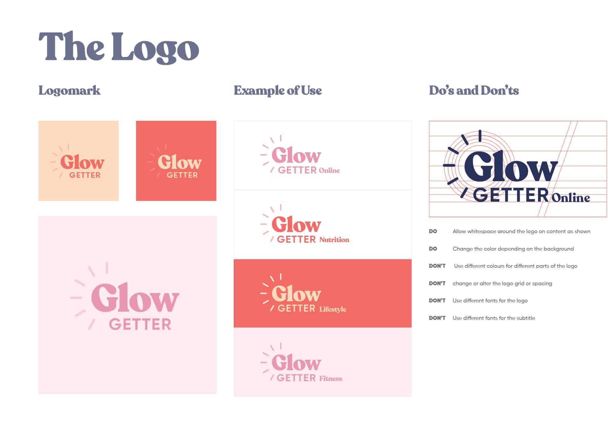
The Logo
The logomark is a simple typography based logo, yet with a strong font it exudes personality. The unique font sets GlowGetter apart as a brand unconcerened with the status quo.
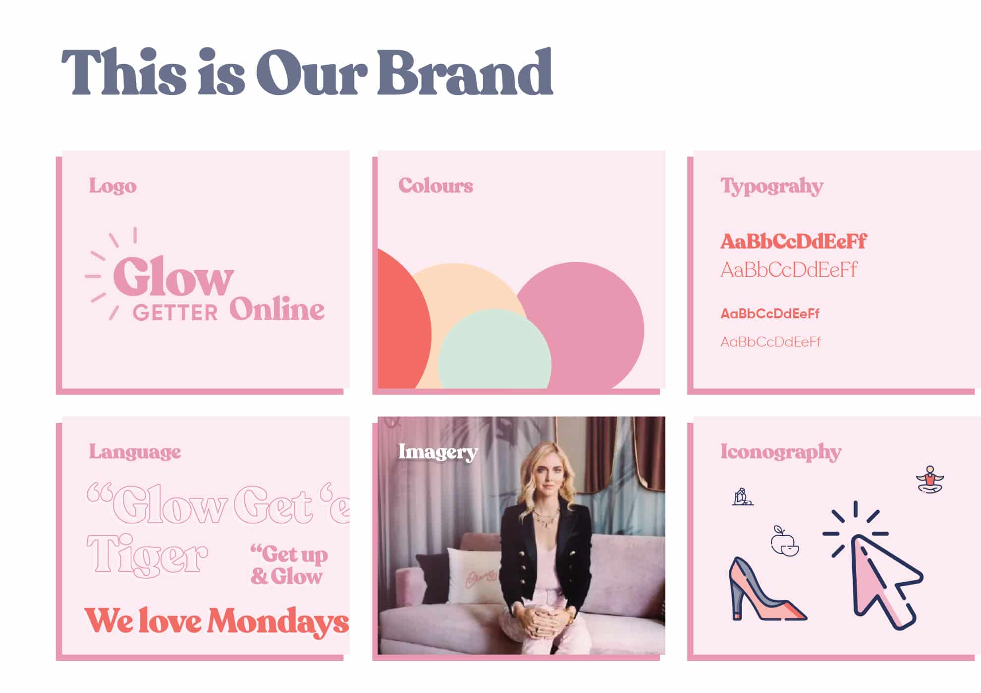
Style Tile
I developed a style tile for the GlowGetter brand,, which julie can use to guide her coaches for using the brand on a day to day basis across web, print and social media.
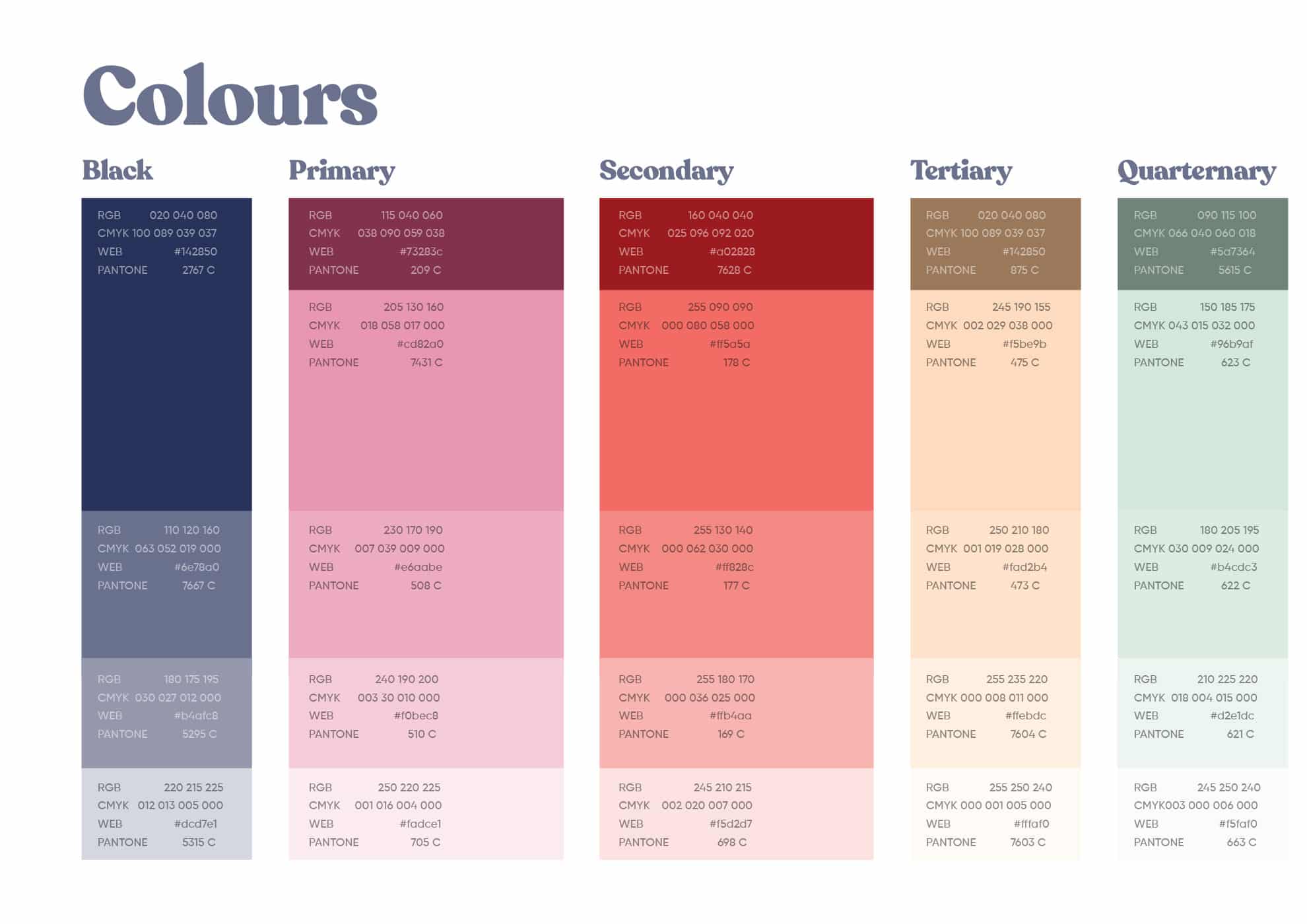
Colour Scheme
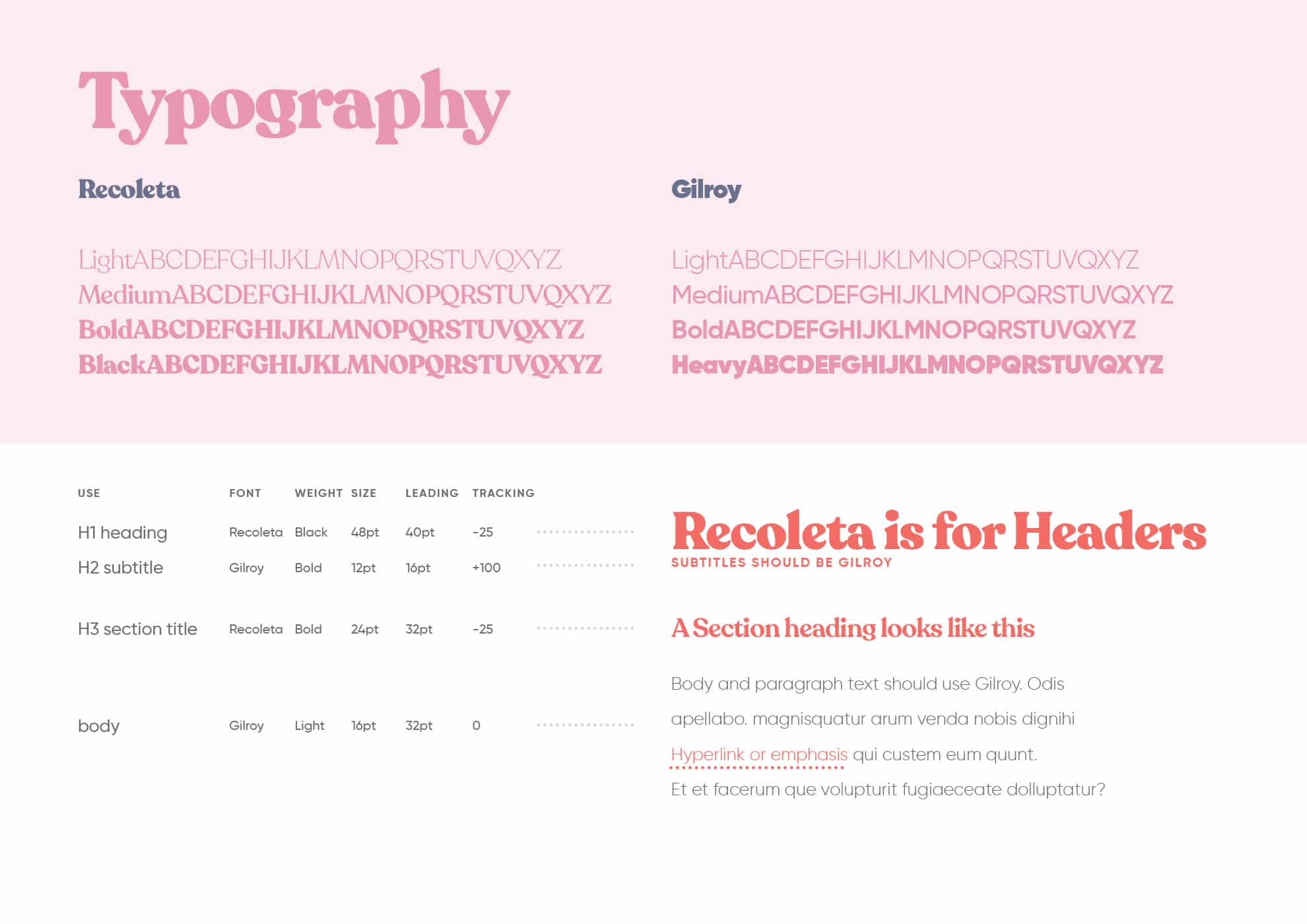
Typography
I’ve used a quirky font to establish how GlowGetter is breaking away from the norm, with an upbeat outlook.
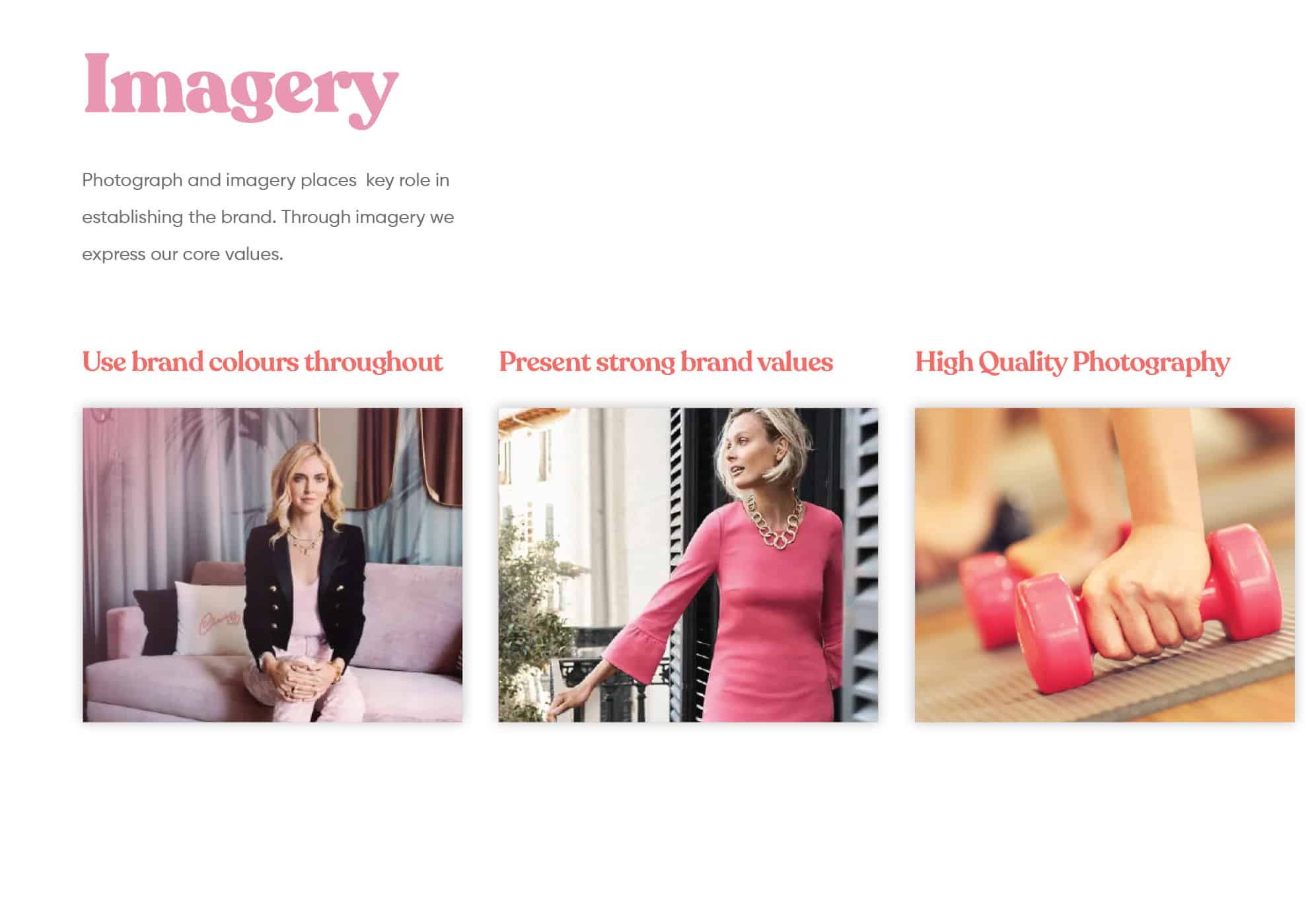
Photography
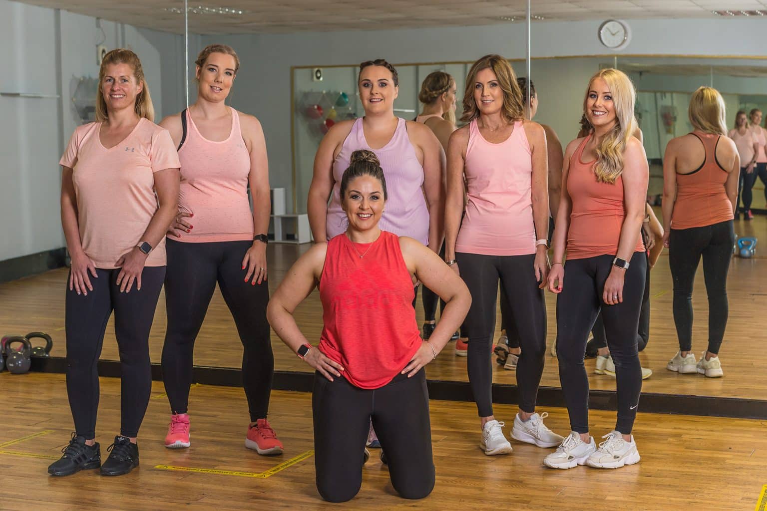
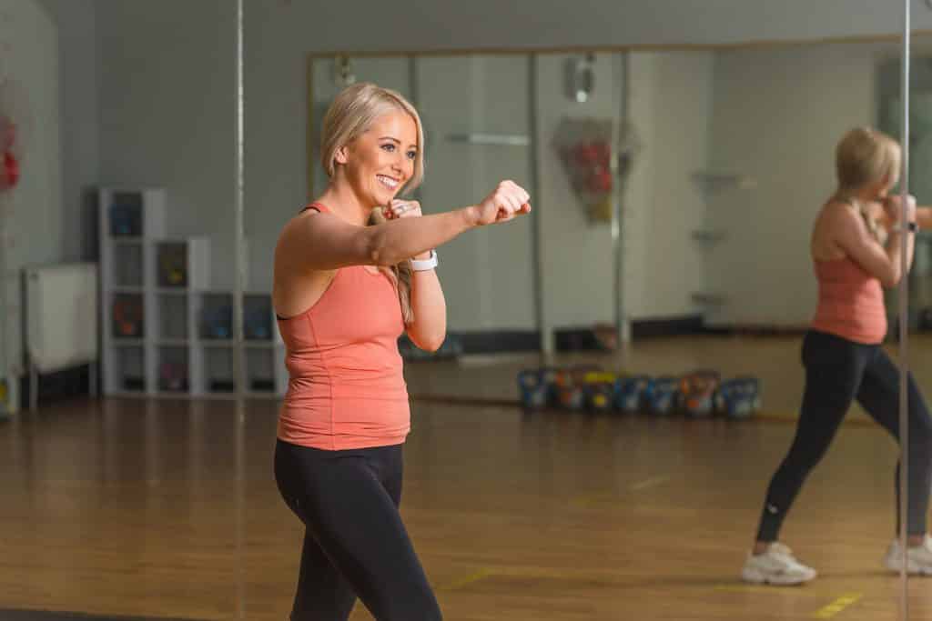
The imagery used for the brand focusses on pastel colours and bold, empowered women.
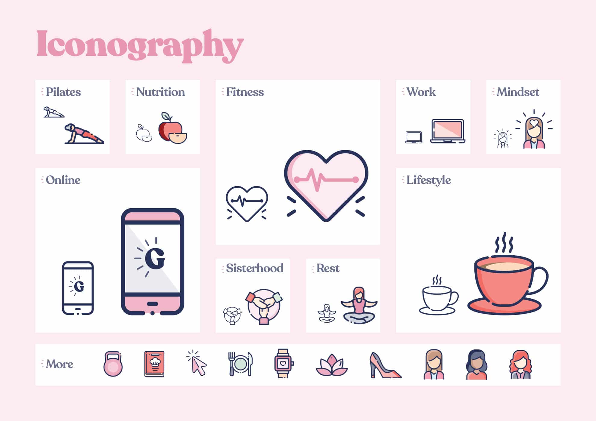
Iconography
For this branding project i have created a full set of icons for Julie to use across her social channels. Each icon is carefully crafted, bespoke to the Glow Getter Brand
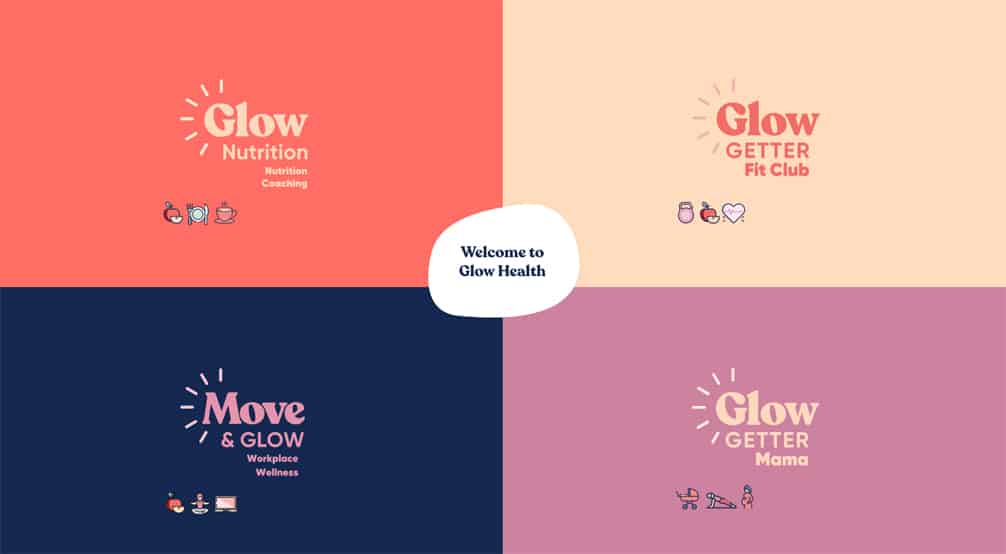
Sub Brands
I’ve also designed a number of sub-brands for various divisions of GlowGetter as the brand expands to target each audience with a more specific message.
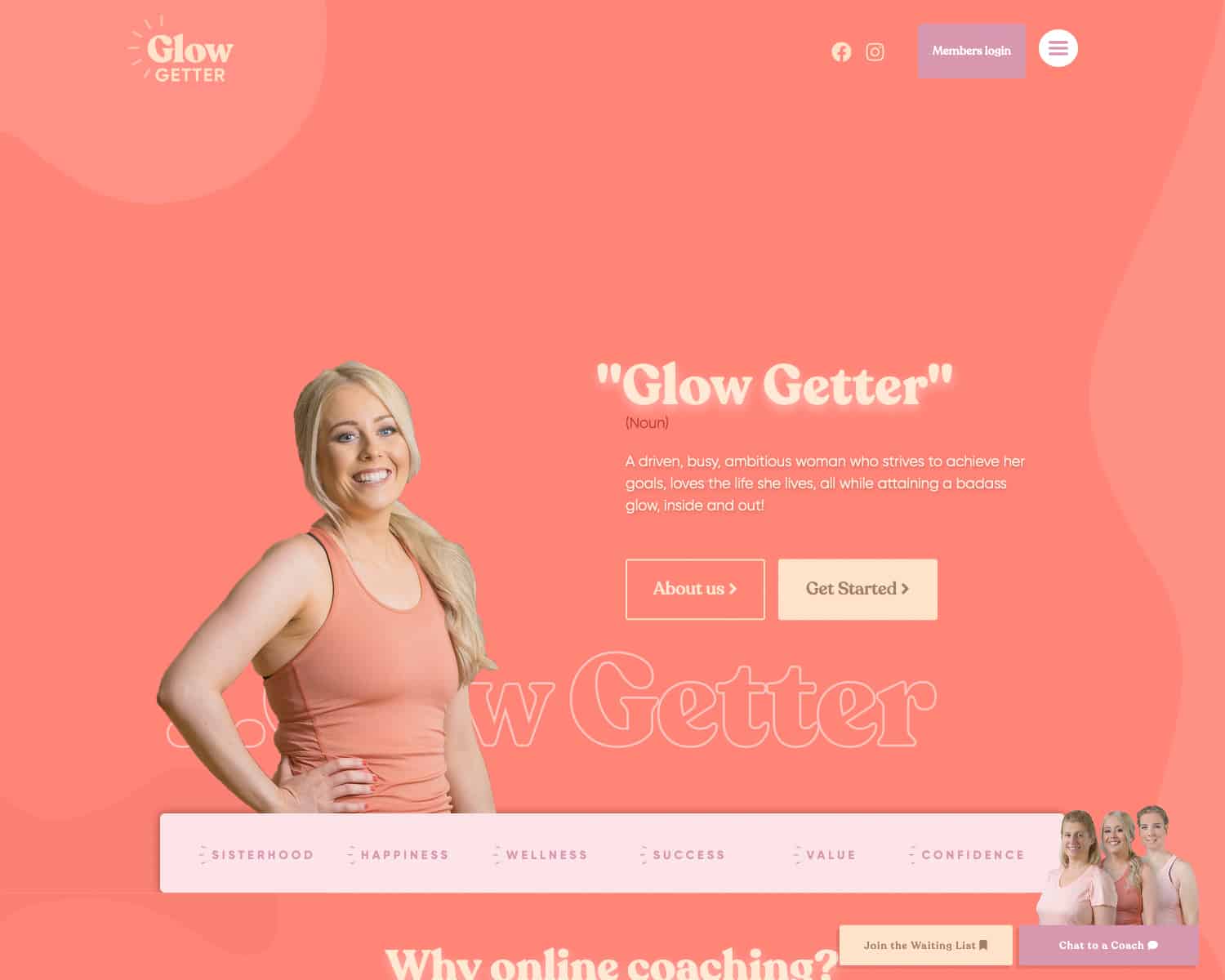
GlowGetters
We open with a bang, and a strong message of what GlowGetters is about
Membership Website
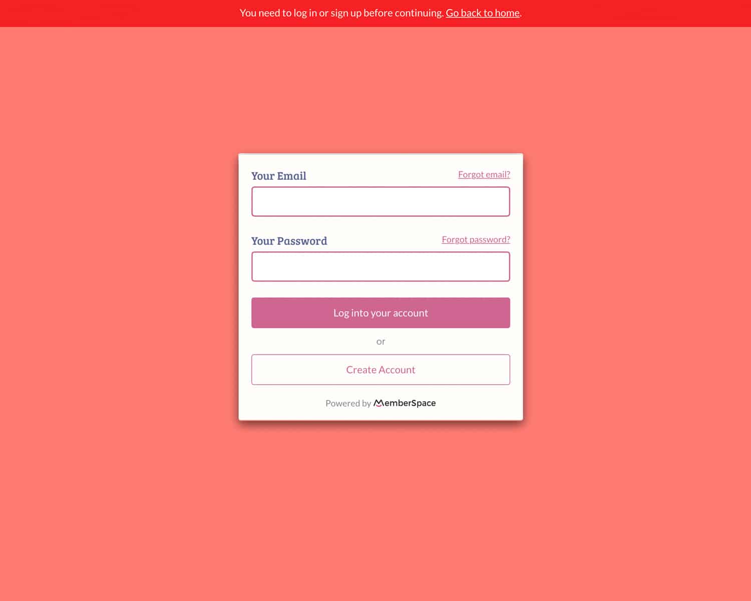
At the core of the website is a robust membership system, protected by a gated signup functionality.
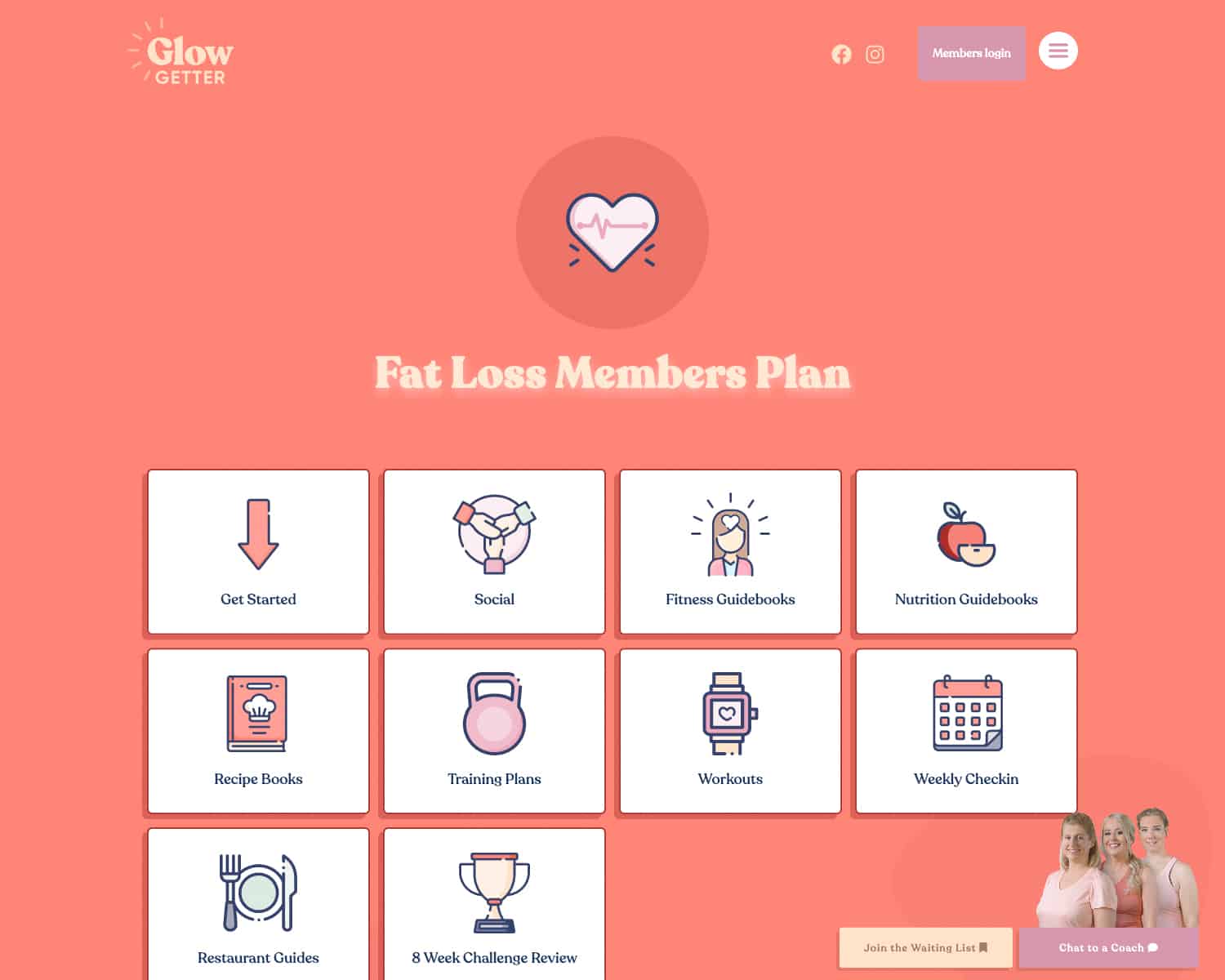
Members hub
Each section of the members page has it’s own handcrafted icon and thumbnail
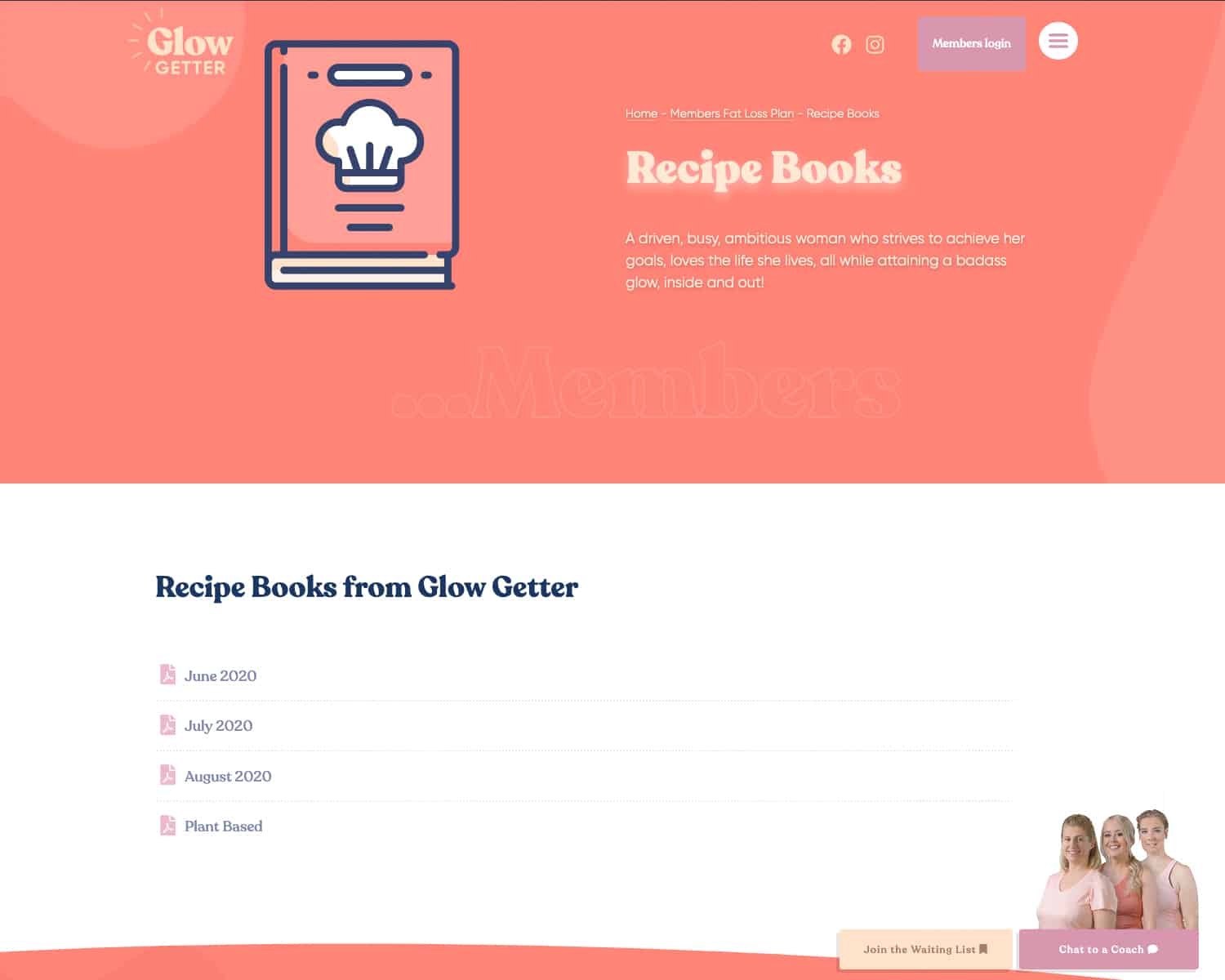
Members Page
The membership website has a number of members pages with downloadable resources and articles for members, protected by a password and login screen.
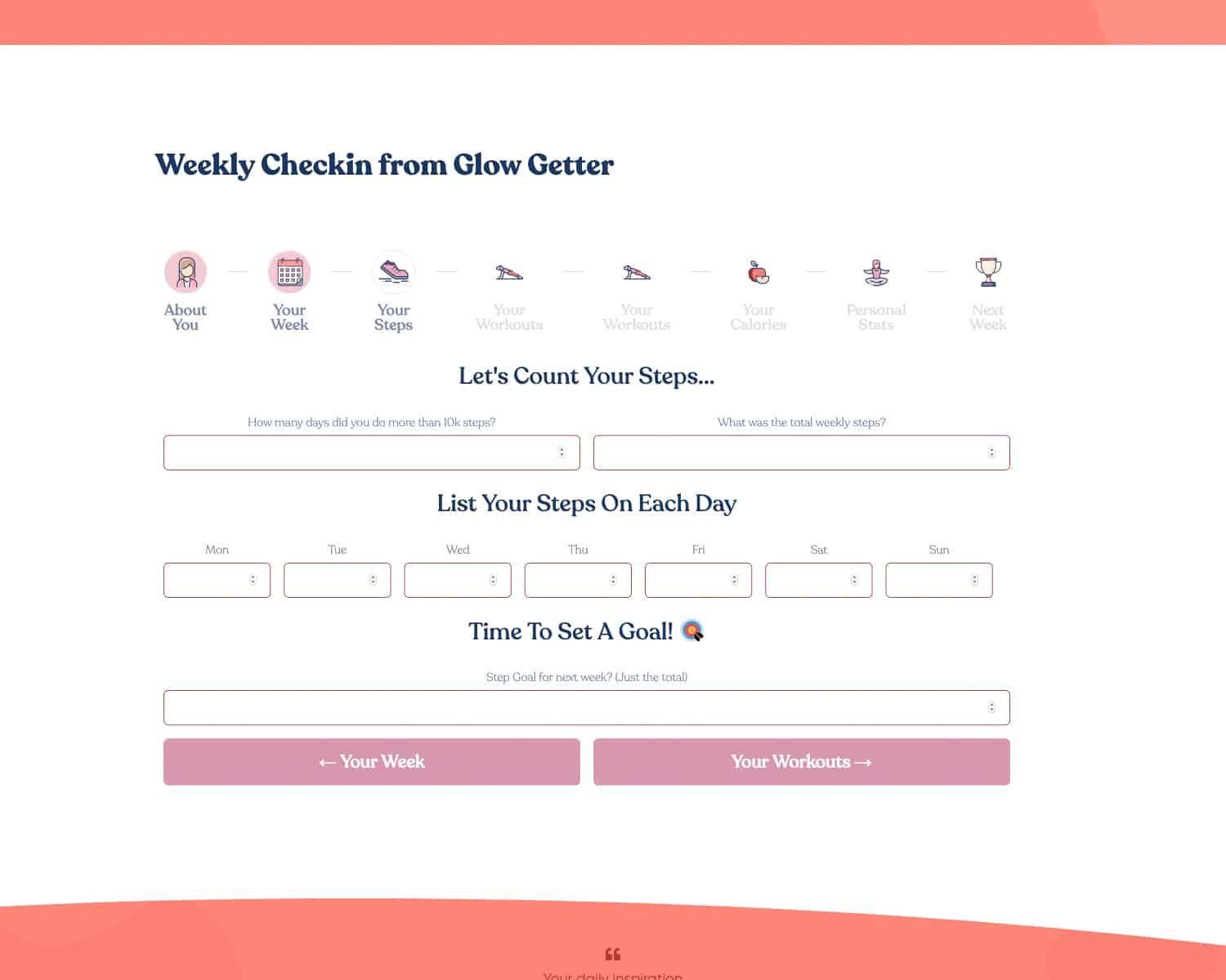
Weekly Checkin Form
I also designed a bespoke staged form where members can check in with their coach on a weekly basis, and gather personal details of their GlowGetter journey
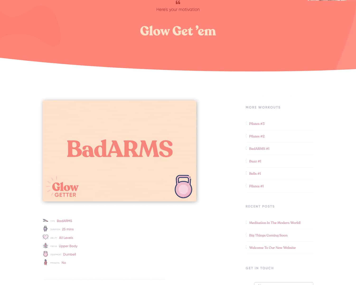
Workouts
Users can search and filter workouts by a number of variables to find the perfect workout.
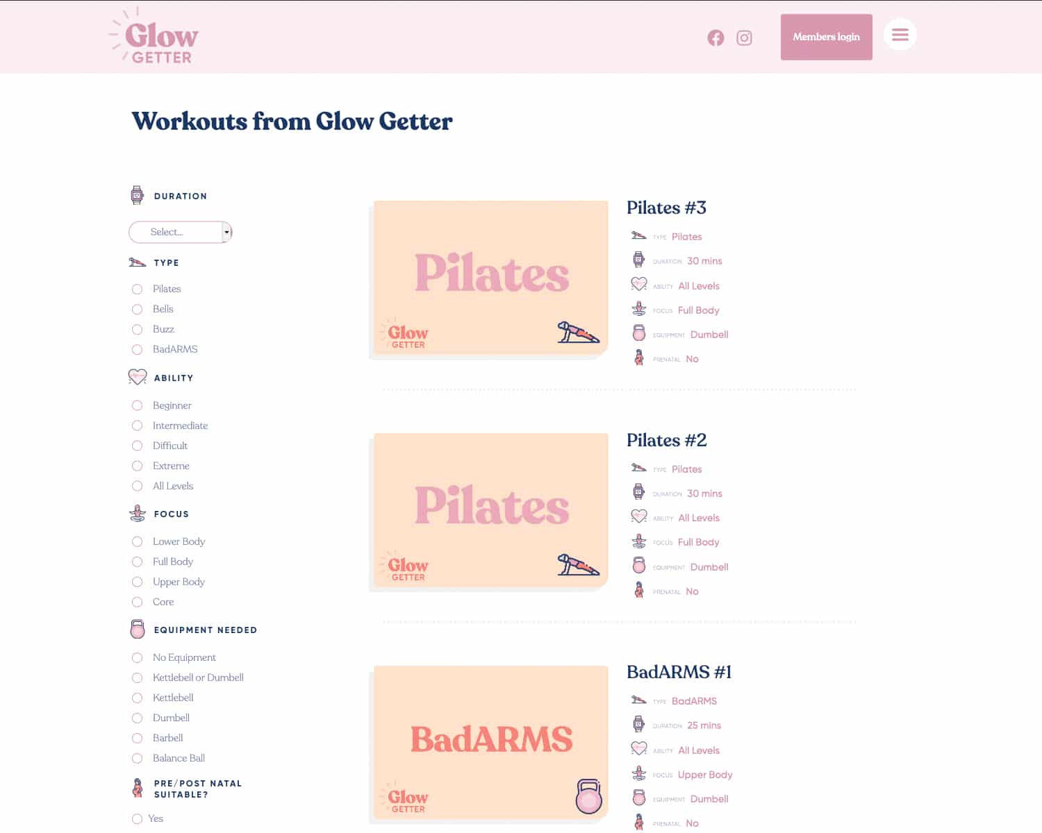
Workouts Page
Each workout is given it’s own video walkthrough, vital stats about each workout, aswell as a motivational quote to get them going!
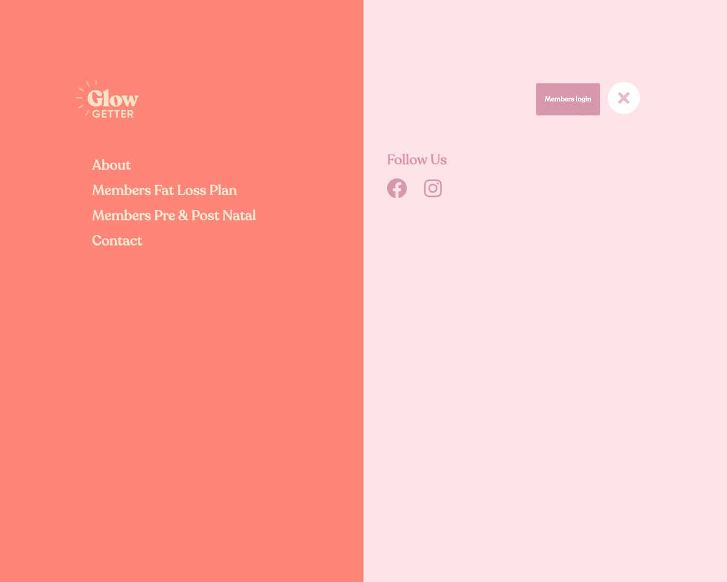
Full screen Menu
The site features a full screen menu with an Instagram feed, to help users navigate the site and explore the full features that GlowGetter has to offer
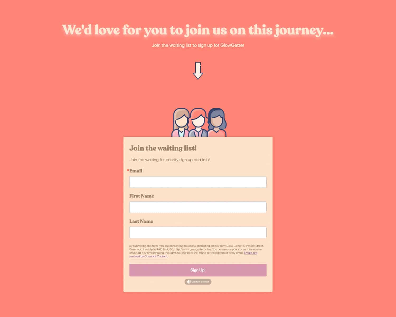
Sign up Popups
To improve user conversion the site features a sign up popup with testimonials from satisfied members.
The Sign up button appears at critical points including at the start of the page, and the end of the page.
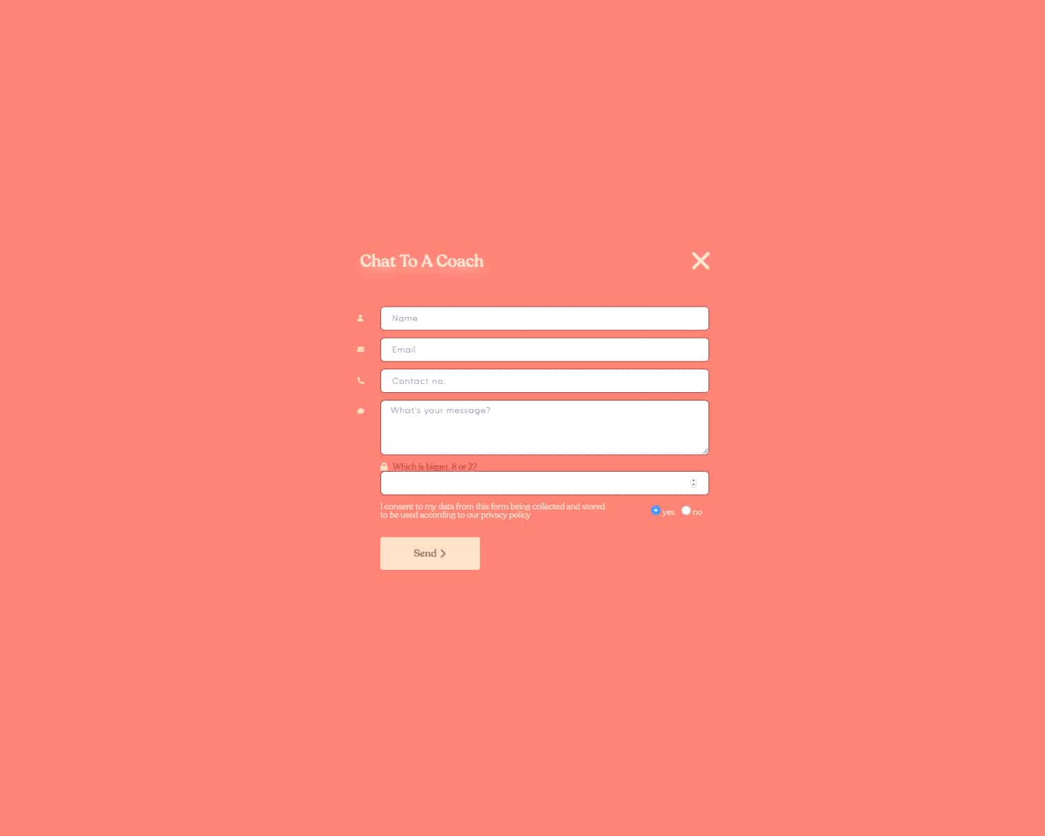
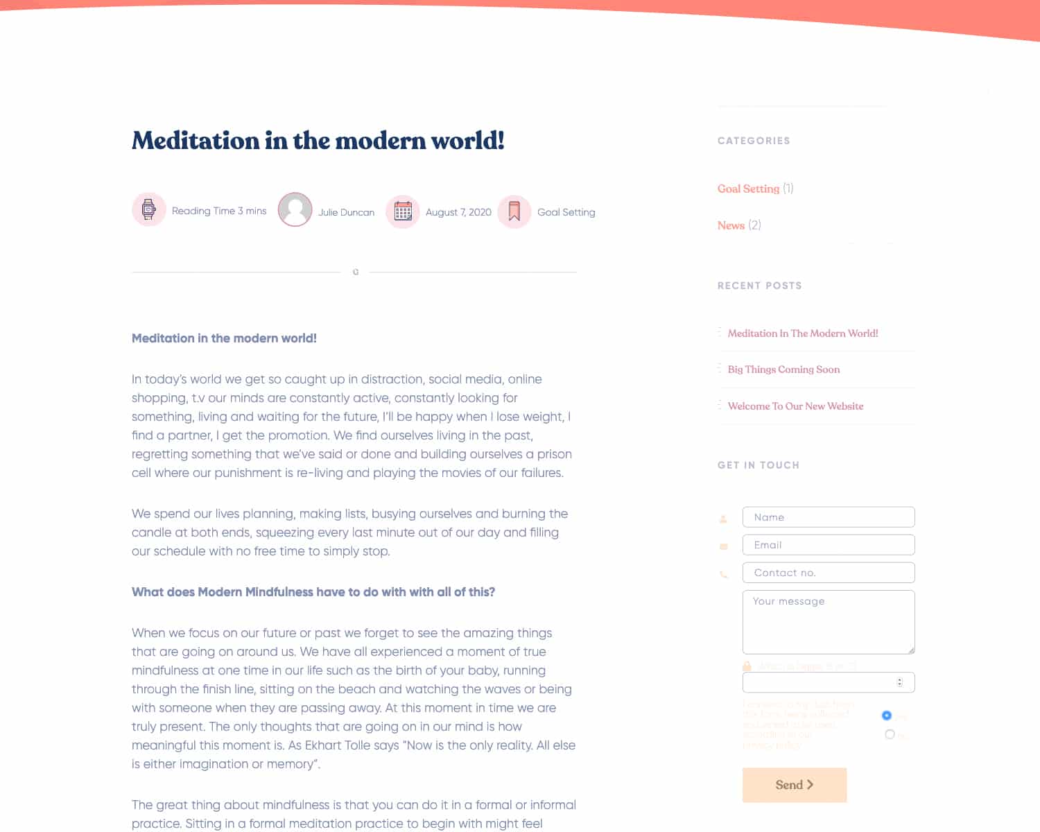
Chatbox for Coaches
The website features a sticky contact button which appears at opportune moments to allow members to chat directly to their coach, as part of the value of their membership plan
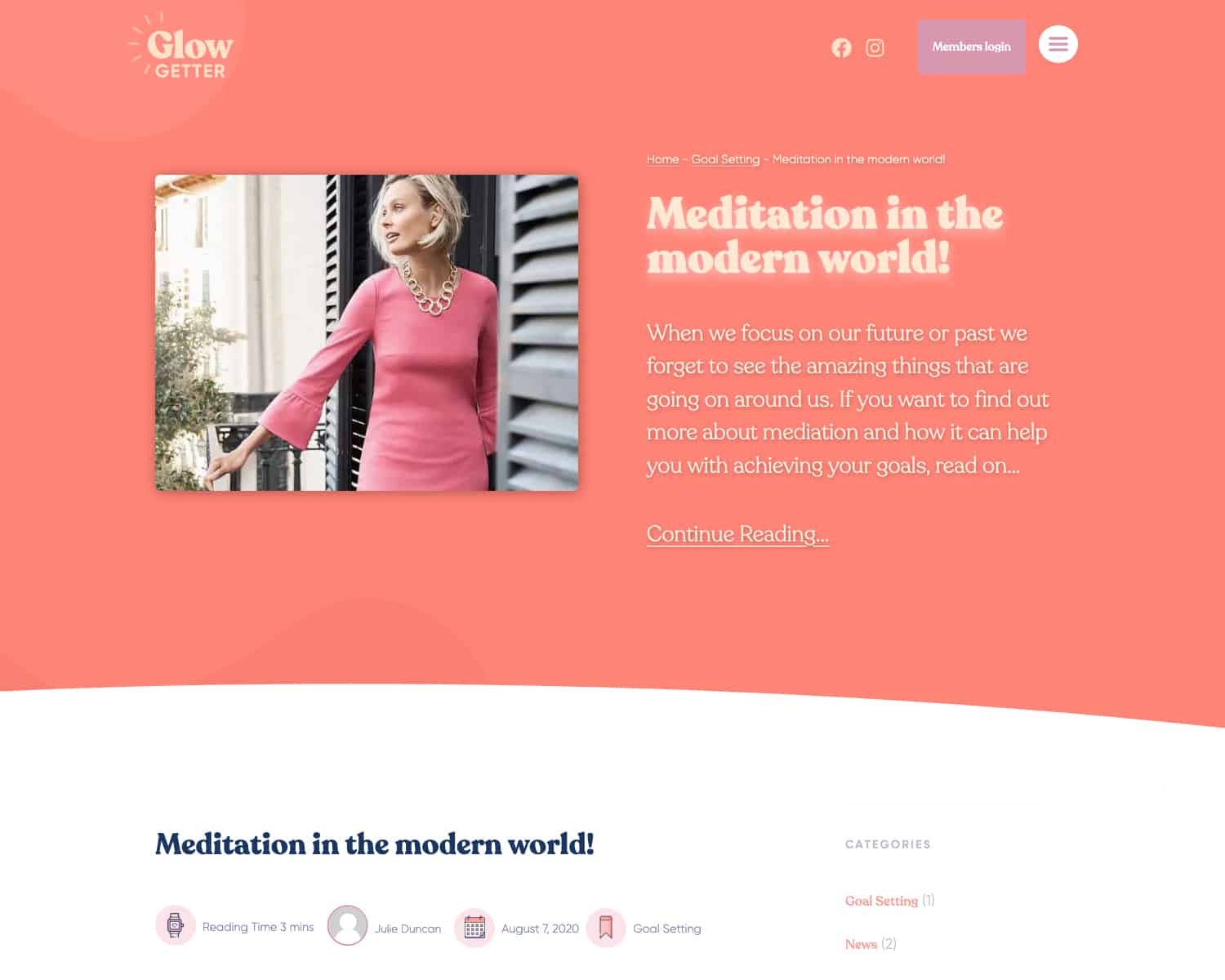
Coaching Blogs
GlowGetter will host a nubmer of self help guides, how tos and info peices written for the members
Coaching Blogs
The blog pages give users plenty of opportunities to get to know the brand, explore the site, and discover more of the value that GlowGetter offers.
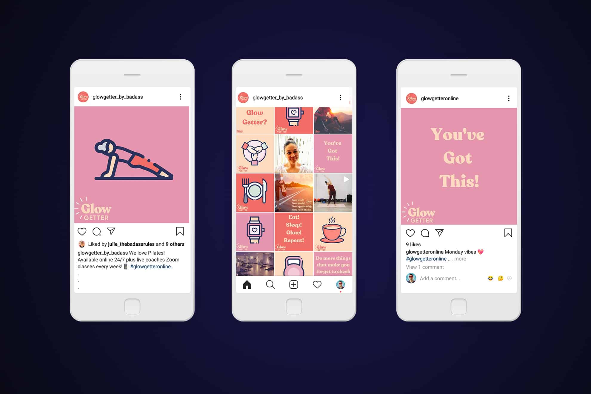
📣 Social Media Assets
GlowGetter is a brand which lives on social media and mobile, and I’ve helped Julie to develop a number of social media assets which she uses through Canva to publish creative posts on her Instagram
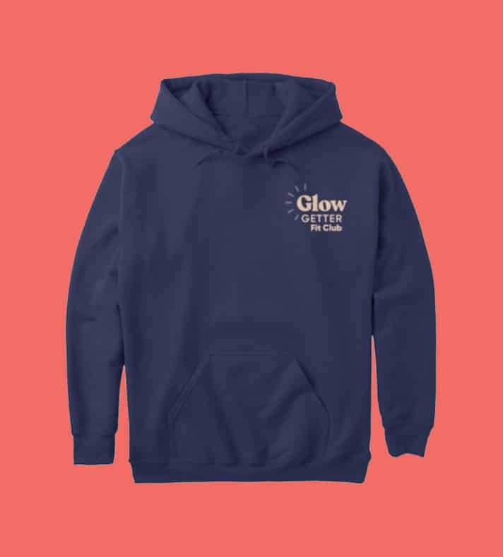
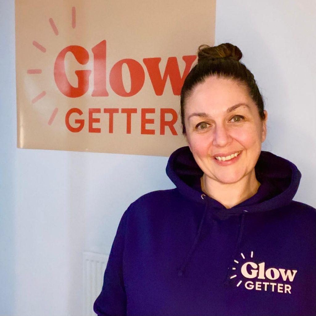
👕 Branded Hoodies
I provided logo design and graphics for producing printed clothing and branded hoodies for Glow Getter