
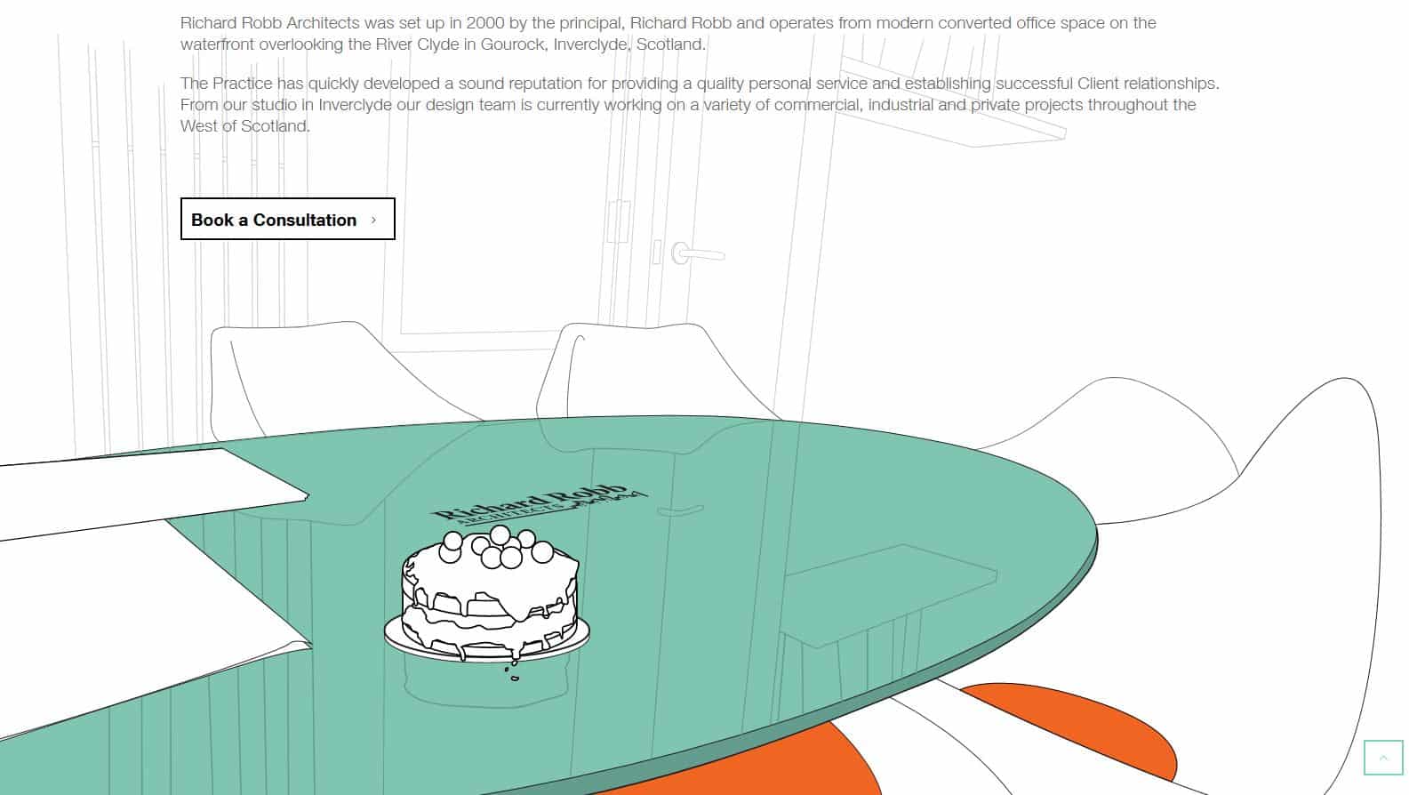
When I started working with Richard Robb Architects from their studio in Gourock there was no singular brand identity to speak of. The brand was defined by several existing visual elements in the office and company stationery such as a city skyline and an existing font. Design Hero worked with these elements to build a unified brand identity around these elements.
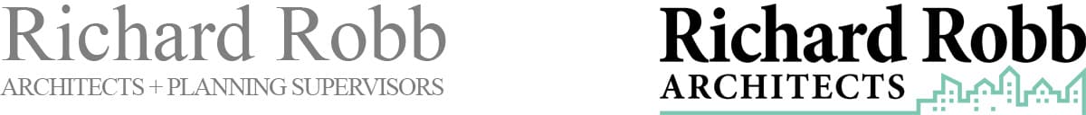
Old logo vs New logo
Clean lines, generous white space and repeating geometry, as well as the careful use of greyscale, were used as themes throughout the brand to lend a professional, modern impact to the architectural practice.
Logo Design
The logo was assembled from a skyline graphic used on the studio windows and the text was rearranged to sit more neatly in the logo as well as adding more contrast between text lines to bring out Richard Robb as the principal architect. The address was added as a tagline to the logo through the logo can be used independently with or without it.
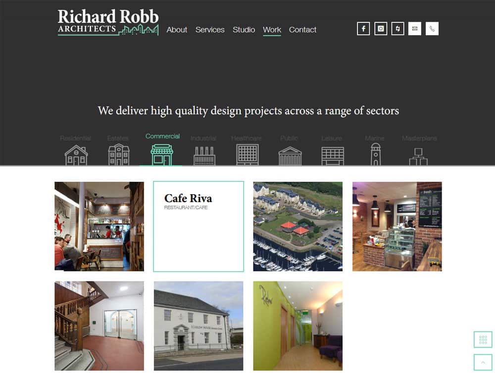
Project Gallery
The backbone of the site is the project gallery, where Richard Robb Architects can showcase the business’s star projects.
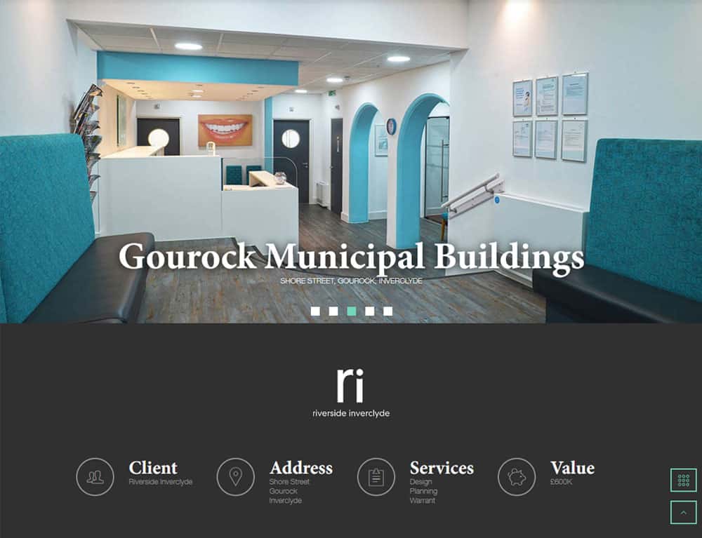
Portfolio Project
Each project shows key information, as well as high impact visuals, graphics and photography to help sell the project.
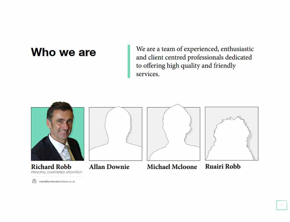
Team Profiles
It also helps to make sure that you have clearly visible personal profiles so that your clients can connect a name to the face. People like to see that you are real!
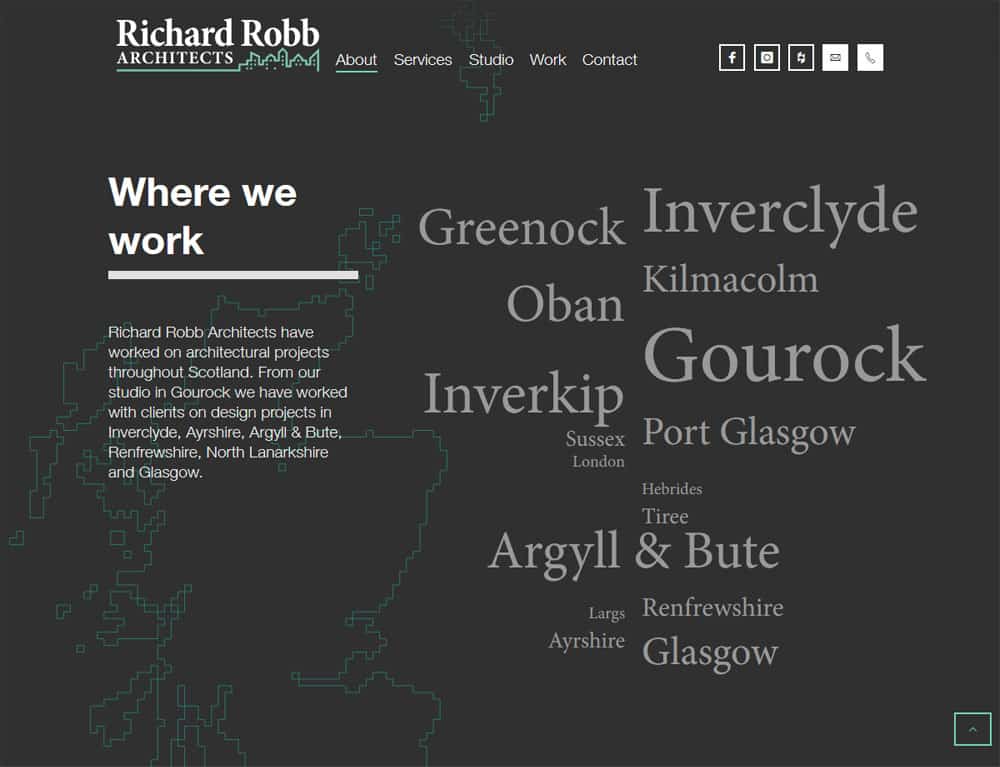
Local Service Areas
Clients will look for relevant businesses in their local area so it was important that I create a local area page to show the areas the business covered.
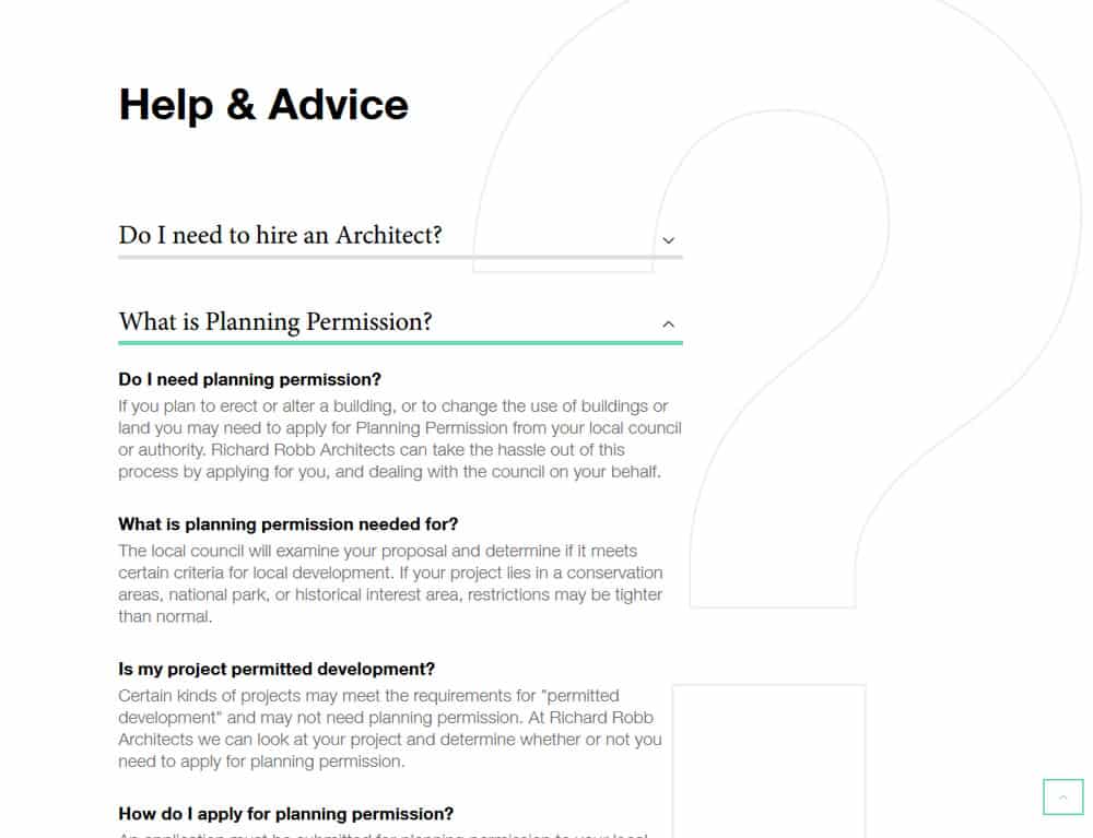
Help and Advice
I designed a help and advice section with common questions and FAQs for our clients. This turns Richard Robb Architects website into a hub for useful advice for our customers.
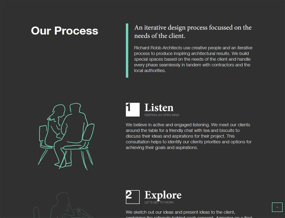
Our Process
The process page was equally of value to show what Richard Robb Architects does differently from the competition.
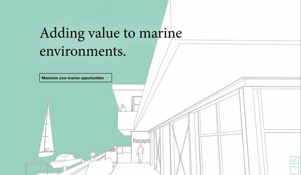
Custom Graphics
I designed custom artwork and illustration for the website to help Richard Robb Architects stand out from the competition.
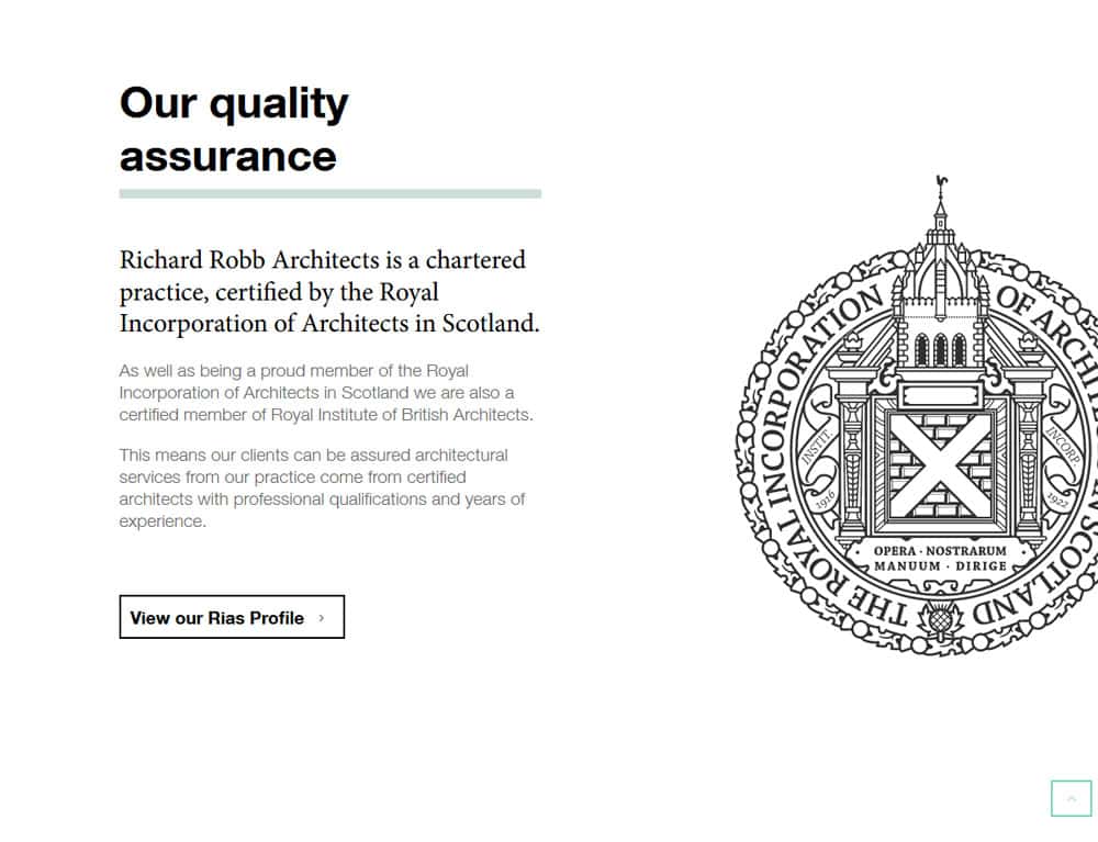
Accrediations
It’s very important to establish trust. One way to do this is show your business’s accreditation and testimonials.
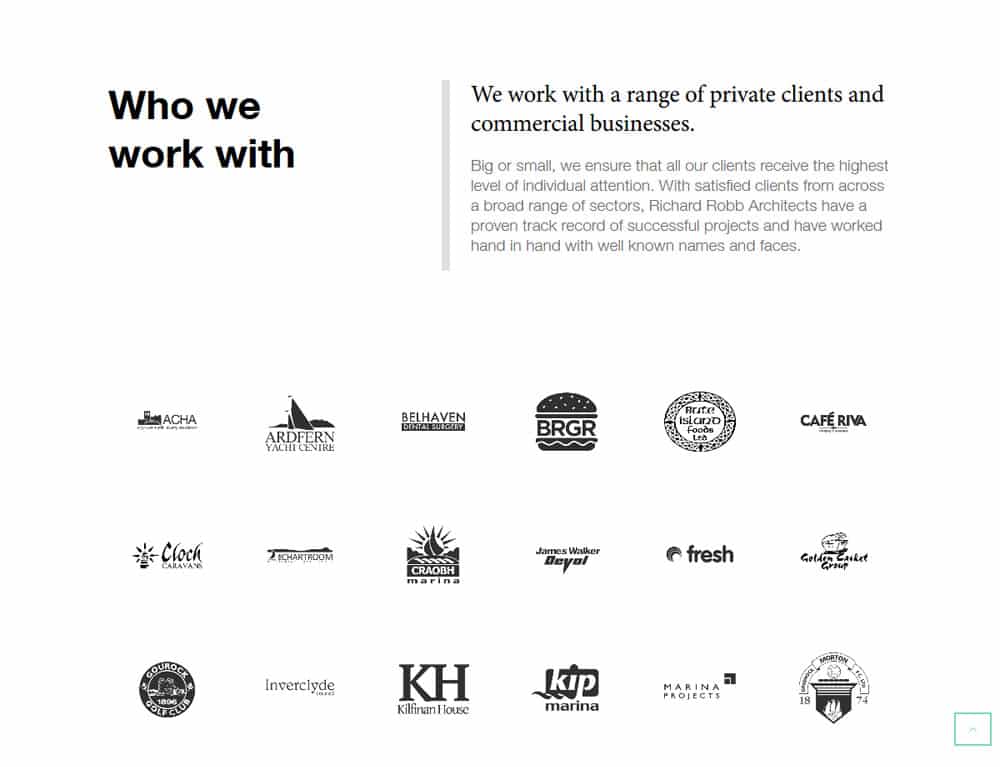
Clients
A third part of trust is establishing social trust. This means clients will be more likely to convert if they know you have worked with people they know and trust.
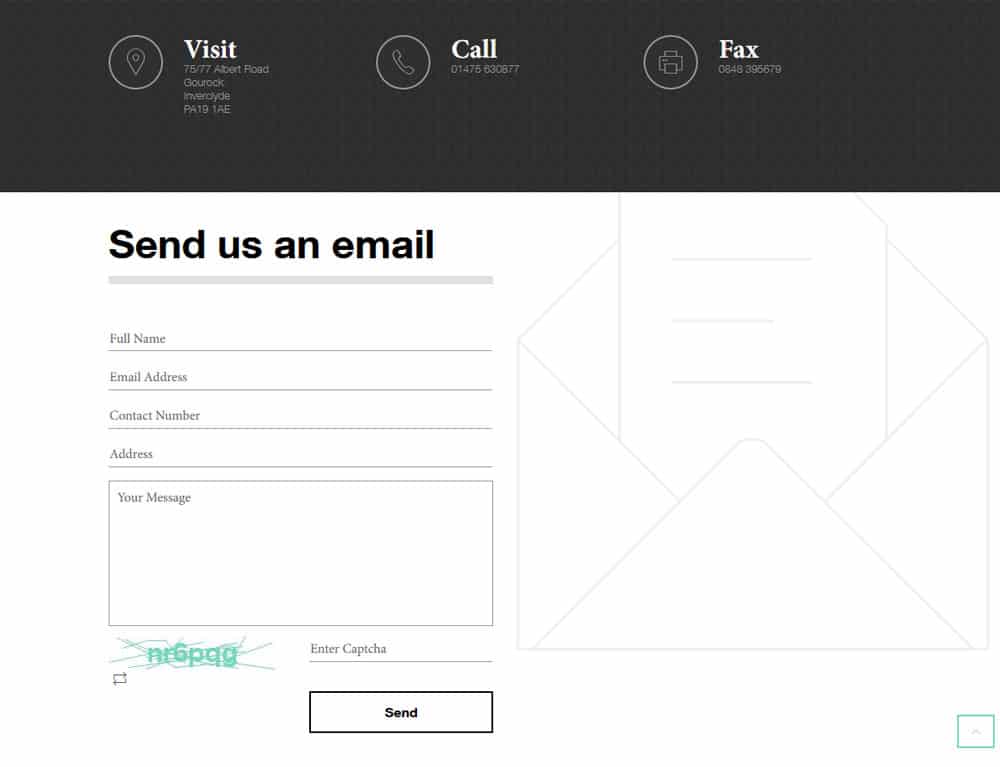
Contact
Once the client knows the value the business offers, and has established trust they will hopefully be ready to convert!
This is why it is vital that you provide opportunities for them to contact you.
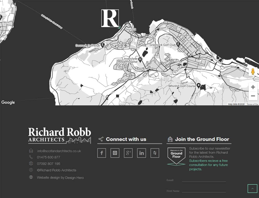
Contact Map
I also created a custom-styled and branded map so clients could locate the design studio
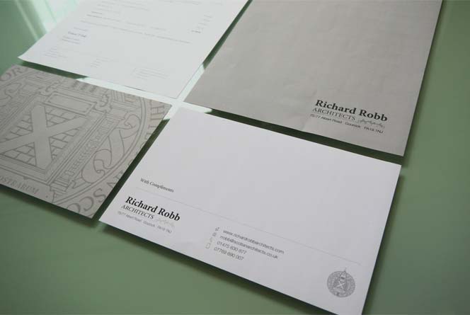
📃 Branded Stationery
- Drawing Templates
- Fee Invoices
- Standard Letters
- Invoices
- Meeting Minutes
- and more…
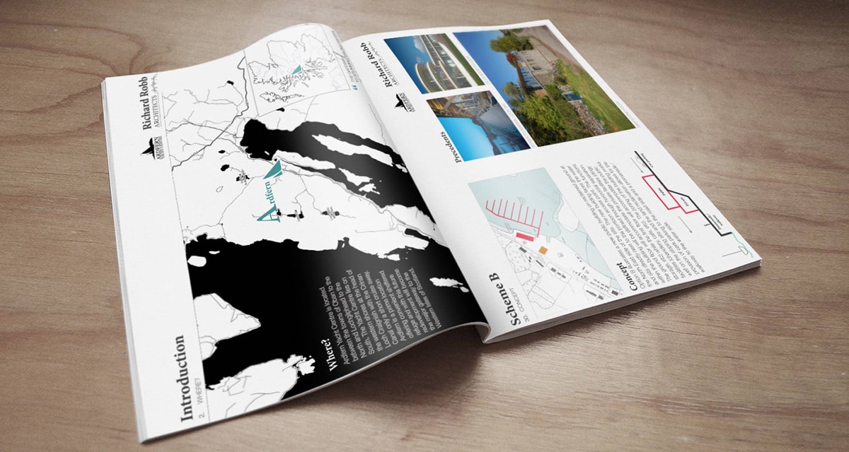
📘 Sales Brochures
I created various sales brochures to pitch showcase projects to potential clients in various sectors
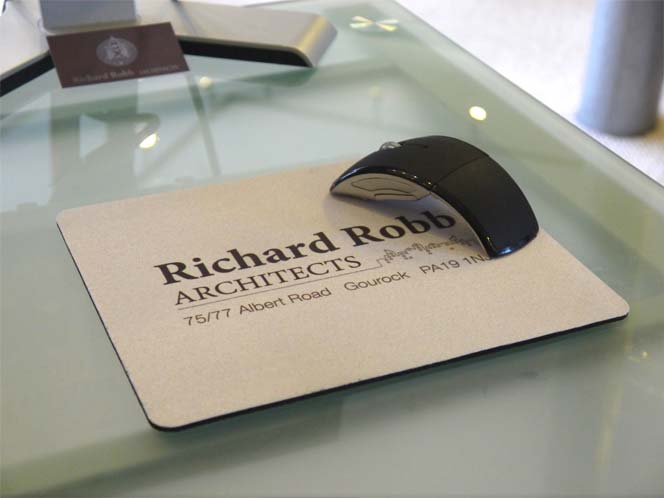
📃 Branded Stationery
I also applied the brand to various merchandise including pens, mouse-mats, notes, computer monitors, glazed desks and more…
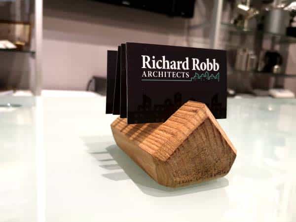
📇 Business Cards
I created several designs of business cards for Richard Robb Architects.
I also made this nifty business card holder to hold them!
Standard size, premium gloss finish with silver foil logo
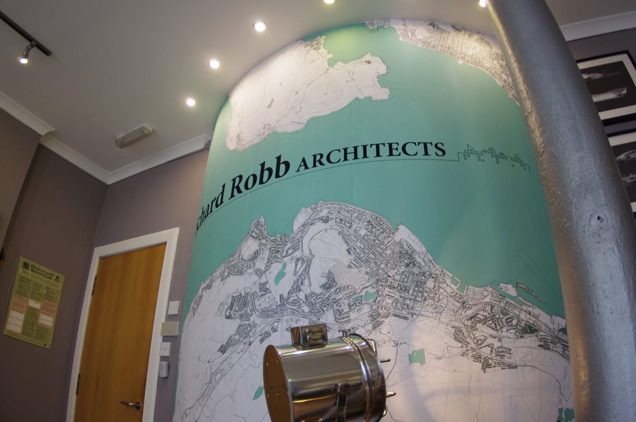
🖨️ Branded Mural
I designed and printed, and wallpapered this branded mural as an impressive focal point for clients coming in to the studio.
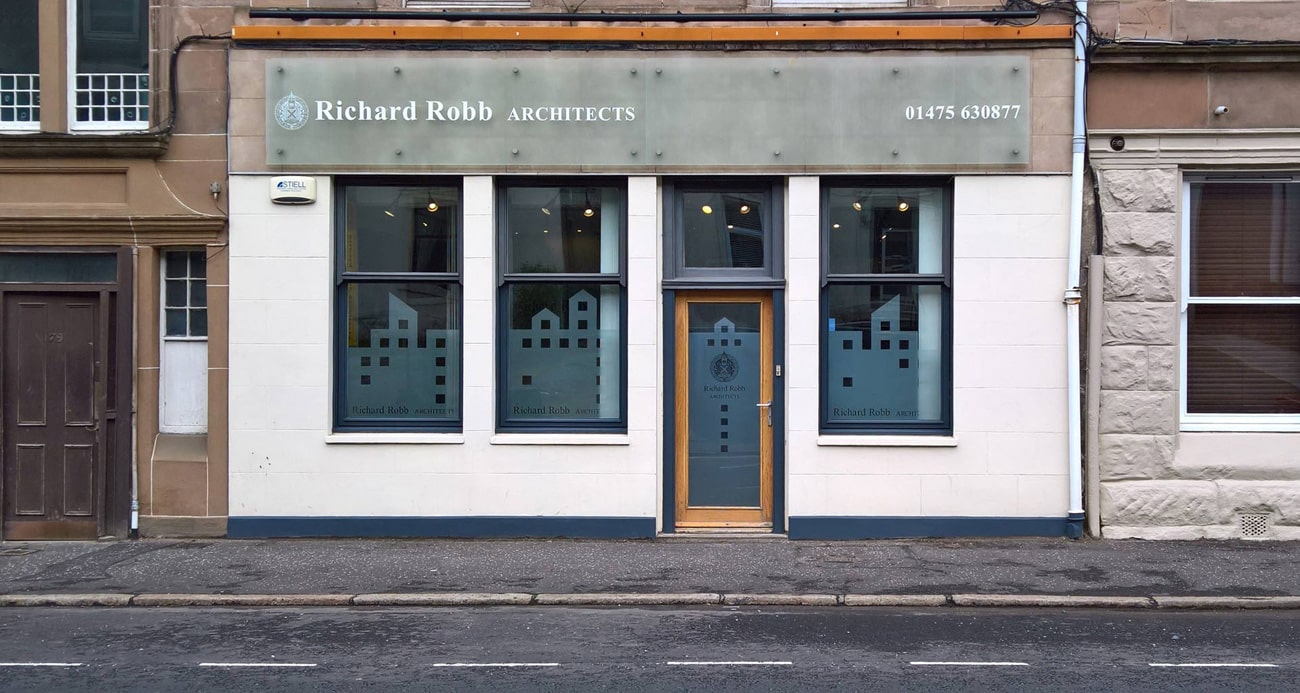
🏪 Shop Signage
New shop signage and window decals in style with the new brand helped the office stand out on the high street.
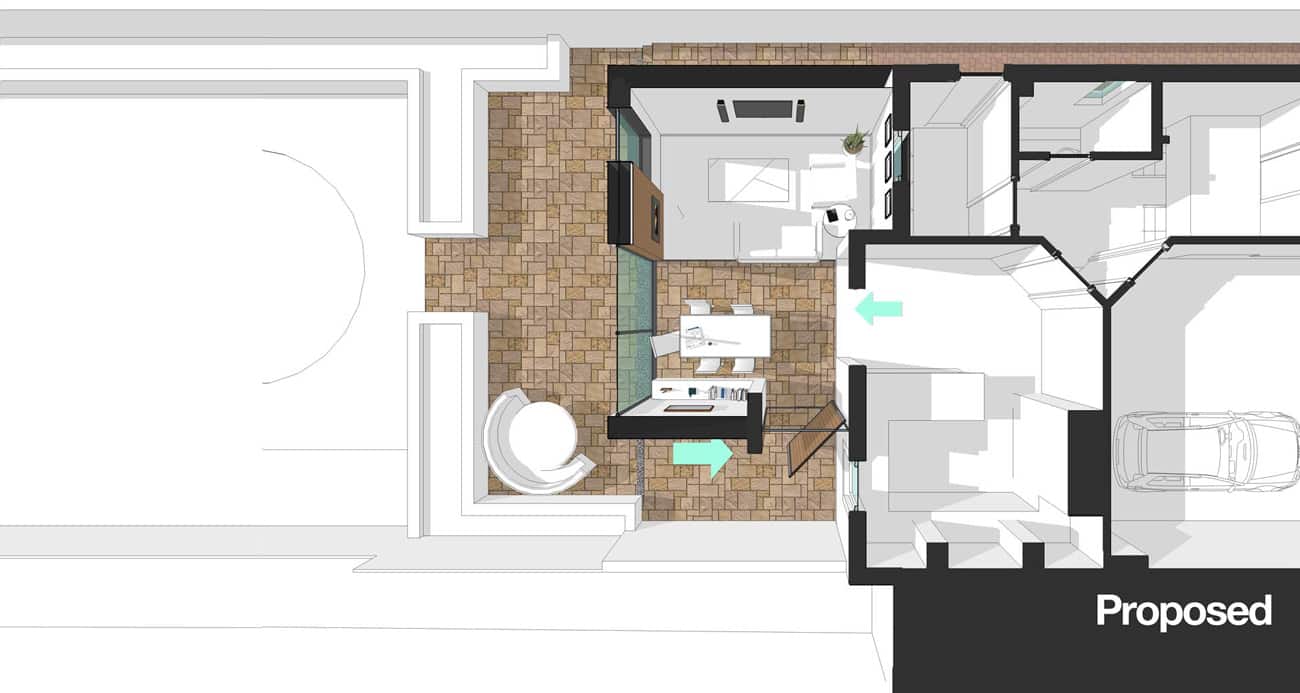
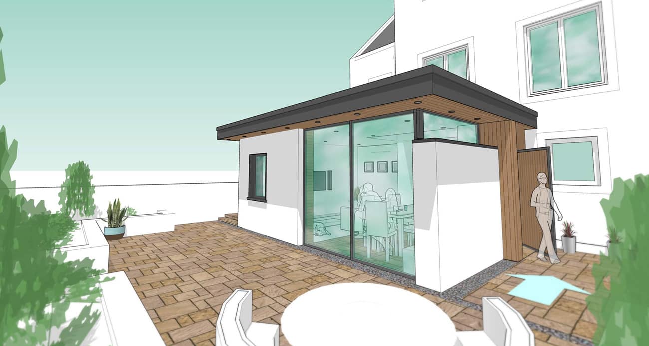
📦 3D Rendering
I rendered the designs from the practice in 3D so that clients could better visualize their projects.
📦 3D Rendering
This increased the value of our service to our clients.
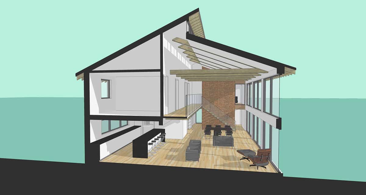
📦 3D Modelling
✍️ Illustration and Artwork
I designed various illustrations and custom artwork, both for client projects and for internal marketing and promotions such as news articles, press coverage, and newsletters.
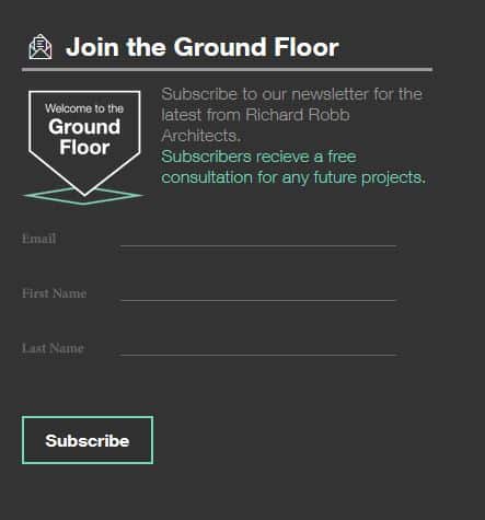
Mailchimp Newsletter
I created a branded newsletter for the practice called the Ground Floor, keeping our clients, and local residents up to date with the latest developments in their local area. It gave unique insights in local development and urban planning, as well as tips to improve your homes on a budget.
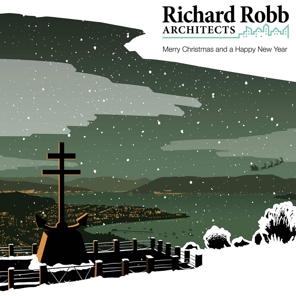
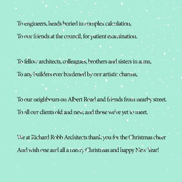
💌 Greetings Cards
I sent branded Christmas cards to our client list.
💌 Greetings Cards
It was a good way to strengthen relationships with clients, contractors and agencies from Richard Robb Architects shortly before Christmas as a way of greeting.
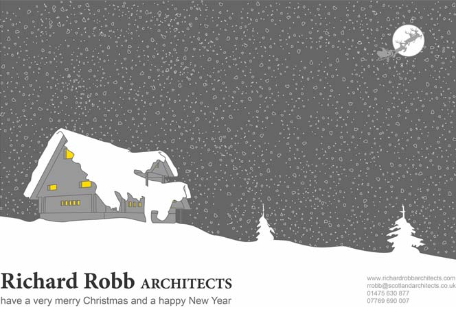
📅 Seasonal Marketing
The minimalist approach to greyscale, colour and lines was again used to create a professional look unique to Richard Robb Architects
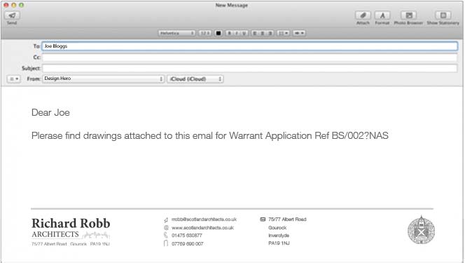
📨 Email Signatures
I designed branded email signatures with active links and effects for use with Outlook and other email clients