This is a familiar frustration.
Your website gets traffic.
People land on it.
They look around.
Then they leave.
No calls.
No form fills.
No bookings.
Nothing.
Across Scotland and the UK, business owners tell us the same thing.
They invested in a website.
They did what they were told.
But it never delivered.
Here is the truth.
Most conversion problems are not mysterious.
They are not caused by bad luck.
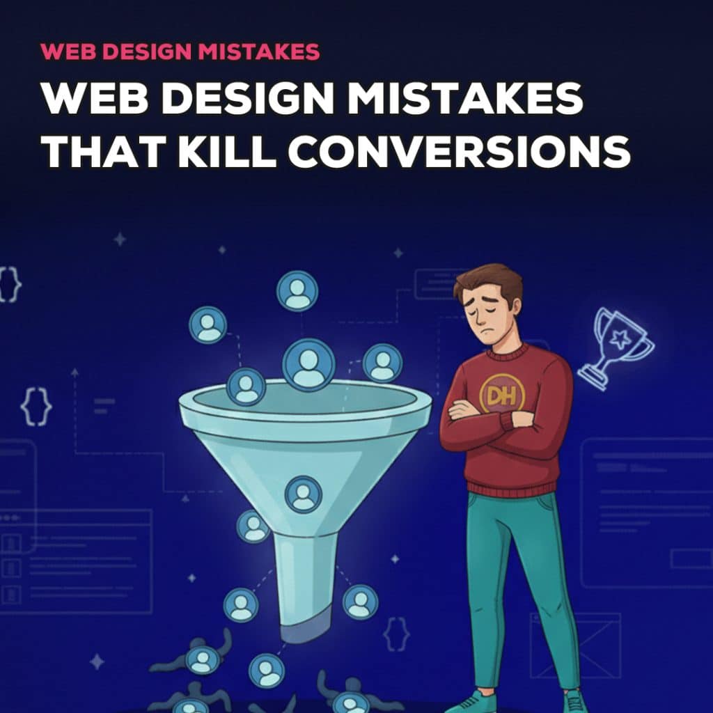
They are caused by common web design mistakes that quietly push users away.
The frustrating part is that many of these mistakes are avoidable.
They come from poor strategy, not poor effort.
This article is intentionally honest.
It will call out what is killing conversions on most small business websites.
It will explain why these issues matter.
And it will show what should be done instead.
If your website looks fine but does nothing, you will recognise a lot of this.

What Conversions Really Mean for Small Businesses
Before talking about mistakes, we need to be clear about one thing.
Conversions are not abstract metrics.
They are real actions that affect revenue.
For most small businesses, conversions mean:
- Enquiry form submissions
- Phone calls
- Quote requests
- Bookings
- Sales
Conversions are not likes.
They are not impressions.
They are not traffic numbers on a dashboard.
A website can have thousands of visitors and still fail as a business tool.
If it does not encourage action, it is not doing its job.
Every design decision should support one outcome.
Helping the right user take the next step with confidence.
The Biggest Web Design Mistakes That Kill Conversions
This is where most websites go wrong.
Each mistake below includes three things:
- Why it hurts conversions
- How it shows up on real websites
- What should be done instead
Be honest as you read.
If you recognise your site, that is a good thing.
It means the issue can be fixed.
1. No clear message above the fold
This is the biggest conversion killer.
A user lands on your website and cannot immediately tell what you do.
Why it hurts conversions
Users decide whether to stay or leave in seconds.
If the message is unclear, they leave.
Confusion creates friction.
Friction kills action.
How it shows up
- Vague headlines
- Buzzwords instead of plain language
- Generic statements like “We deliver solutions”
- Important information buried halfway down the page
What to do instead
State clearly:
- Who you help
- What you do
- What problem you solve
Do it at the top of the page.
Use simple language.
Assume the visitor knows nothing about you.
2. Designing for aesthetics instead of users
A website can look beautiful and still fail completely.
Why it hurts conversions
Design that prioritises visuals over usability often hides key information.
Users do not know where to look or what to do next.
Pretty does not equal effectiveness.
How it shows up
- Large hero images with no message
- Text placed over busy backgrounds
- Decorative animations that distract
- Layouts that look impressive but feel confusing
What to do instead
Design with purpose.
Every section should exist for a reason.
Every visual choice should support clarity and flow.
If it does not help the user understand or act, remove it.
3. Weak or missing calls to action
Many websites never actually ask users to do anything.
Why it hurts conversions
If you do not guide users, they will not guide themselves.
People need direction.
How it shows up
- Buttons that say “Learn more” everywhere
- No primary action on key pages
- Calls to action hidden at the bottom
- Too many competing buttons
What to do instead
Decide what action matters most.
- Get in touch
- Book a call
- Request a quote
Make that action obvious.
Repeat it naturally throughout the page.
Use clear language that explains the benefit.
4. Confusing navigation
Navigation should feel invisible.
When it does not, conversions suffer.
Why it hurts conversions
Too many options overwhelm users.
They hesitate.
They leave.
How it shows up
- Long menus with too many items
- Dropdowns within dropdowns
- Pages that overlap in purpose
- Important pages hidden
What to do instead
Simplify.
Group related pages.
Remove anything non essential.
Guide users through a logical journey.
A confused user does not convert.
5. Poor mobile experience
Most traffic is mobile.
Many sites still treat mobile as an afterthought.
Why it hurts conversions
Mobile users are impatient.
If the site is awkward to use, they leave immediately.
How it shows up
- Text too small to read
- Buttons too close together
- Forms that are painful to complete
- Slow load times on mobile networks
What to do instead
Test every page on a real phone.
Make forms simple.
Ensure calls to action are easy to tap.
If mobile does not work, nothing else matters.
6. Slow loading pages
Speed is not optional.
Why it hurts conversions
Slow sites feel untrustworthy.
Users abandon them quickly.
Even a one second delay can reduce conversions.
How it shows up
- Large uncompressed images
- Too many plugins
- Heavy animations
- Cheap hosting
What to do instead
Optimise assets.
Use proper hosting.
Strip out unnecessary features.
Fast sites convert better. Every time.
7. Generic stock imagery
Stock photos rarely build trust.
Why it hurts conversions
Generic imagery feels fake.
Users recognise it instantly.
If the visuals feel staged, the business feels distant.
How it shows up
- Smiling people in offices that are not yours
- Overused stock models
- Abstract imagery with no context
What to do instead
Use real photos where possible.
Your team.
Your work.
Your environment.
Authenticity beats polish when it comes to trust.
8. Inconsistent branding
Inconsistent brand identity creates doubt.
Why it hurts conversions
When fonts, colours and tone change across pages, the site feels sloppy.
Users question credibility.
How it shows up
- Multiple font styles
- Random colour usage
- Mixed tones of voice
- Different layouts on similar pages
What to do instead
Define brand rules.
Stick to a limited colour palette.
Use consistent typography.
Maintain the same tone throughout.
Consistency reassures users.
9. Too much copy or not enough
Both extremes cause problems.
Why it hurts conversions
Too much text overwhelms.
Too little leaves questions unanswered.
Clarity sits in the middle.
How it shows up
- Large blocks of text with no structure
- Vague statements with no substance
- Important details buried
What to do instead
Write for scanning.
Short paragraphs.
Clear headings.
Bullet points where helpful.
Say what matters.
Cut what does not.
10. No trust signals
Trust is a prerequisite for conversion.
Why it hurts conversions
If users do not trust you, they will not act.
Simple as that.
How it shows up
- No testimonials
- No case studies
- No proof of experience
- No social proof
What to do instead
Show evidence.
Real testimonials.
Specific outcomes.
Logos of real clients.
Trust removes hesitation.
Why These Mistakes Keep Happening
These issues are common for a reason.
They usually come from:
- Design without strategy
- Template led builds
- No real understanding of the audience
- Rushed timelines
- Designers not thinking like business owners
Most websites are built to look finished, not to perform.
When conversion is not considered from the start, mistakes compound.
How to Fix Conversion Killing Design Mistakes
The good news is this.
Most websites do not need to be scrapped and rebuilt from nothing.
Many conversion problems can be fixed with the right approach.
Here is what actually works.
1. Start with strategy, not visuals
Before changing colours or layouts, step back.
Ask:
- Who is this website for
- What problem are we solving
- What action do we want users to take
If these answers are unclear, no amount of design will help.
Strategy gives design direction.
Without it, changes are random.
2. Clarify the core message
Your message should be obvious within seconds.
Rewrite headlines so they answer:
- What do you do
- Who do you help
- Why should someone care
Strip out buzzwords.
Use plain language.
Speak like a human.
Clear messaging removes friction immediately.
3. Design clear user journeys
Every important page should guide the user.
Homepage to service page.
Service page to proof.
Proof to action.
If users have to think about where to go next, the journey is broken.
Design the path intentionally.
4. Use strong, specific calls to action
Decide what matters most.
- Get a quote
- Book a call
- Request a consultation
Make that action obvious.
Use language that explains the value of clicking, not just the action itself.
Repeat calls to action naturally throughout the page.
5. Build trust into the layout
Trust should not be an afterthought.
Place testimonials near decision points.
Add proof next to calls to action.
Show experience and credibility early.
Trust reduces hesitation.
6. Test and improve
Conversion focused design is not guesswork.
Review analytics.
Watch user behaviour.
Test small changes.
Incremental improvements often outperform dramatic redesigns.
How Design Hero Approaches Conversion Focused Web Design
This is where many agencies fall short.
They design pages.
We design outcomes.
Here is how we approach it.
1. Strategy comes first
We start by understanding the business.
Goals.
Audience.
Services.
Competitive landscape.
This informs every decision that follows.
2. Brand and conversion work together
We do not separate brand from performance.
Tone of voice supports trust.
Visual identity supports clarity.
Structure supports action.
Everything aligns.
3. One point of contact
You deal with the person doing the work.
No account managers.
No miscommunication.
No chasing updates.
Clear communication keeps projects moving.
4. Clear process
Discovery
Messaging
Structure
Design
Build
Test
Launch
Each stage has a purpose.
Nothing is rushed.
5. Designed for Scottish and UK businesses
Local expectations matter.
How people browse.
How they enquire.
What builds trust.
We design with that context in mind.
6. Focus on real results
We care about:
- Better quality enquiries
- Higher conversion rates
- Websites that support growth
Trends come and go.
Results last.
Quick Conversion Check for Business Owners
You do not need tools to spot obvious issues.
Ask yourself these questions.
1. Can users tell what you do in five seconds?
If not, your message is unclear.
2. Is there a clear next step on every key page?
If not, users are being left to guess.
3. Does the site work properly on mobile?
If not, you are losing most visitors.
4. Does the website feel trustworthy?
If not, proof and clarity are missing.
5. Does the design match the brand?
If not, alignment is broken.
If you answered no to more than one of these, conversions are being blocked.
Why Conversion Problems Are Usually Fixable
Many business owners assume their website is a lost cause.
That is rarely true.
Most low conversion websites suffer from a small number of issues:
- Unclear messaging
- Poor structure
- Weak calls to action
- Lack of trust signals
Fixing these often leads to noticeable improvement without rebuilding everything.
The key is knowing what to fix and what to ignore.
When a Redesign Makes Sense
Sometimes fixes are not enough.
A redesign is worth considering when:
- The brand has changed
- The site structure no longer fits the business
- Mobile experience is fundamentally broken
- The platform limits performance
- Content has grown without structure
A redesign should still start with strategy.
Redesigning without fixing the underlying problems only repeats the cycle.
What to Do Before Hiring Help
Before speaking to an agency, get clarity.
Know:
- What is not working
- What success looks like
- What matters most to the business
Avoid agencies that jump straight to visuals.
Ask how they approach conversion, messaging and structure.
If they cannot explain it clearly, walk away.
Conclusion
Most websites do not fail because of bad intentions.
They fail because of common, avoidable mistakes.
The good news is this.
Conversion issues can be fixed.
Clarity can be restored.
Websites can become assets again.
If your site gets traffic but no enquiries, something is blocking action.
Design Hero helps Scottish and UK businesses identify what is broken and fix it properly.
No jargon.
No guesswork.
No vanity projects.
Just clear strategy, smart design and websites that convert.
If you want honest feedback on what is killing conversions on your site, speak to us.
We will tell you what matters and what does not.
About the author

Nicholas Robb, Founder
The original Design Hero founder, solopreneur and marketing expert; Nick will help you supercharge your business success with a broad skill-set spanning a range of digital marketing fields.
If you want help growing your business...


