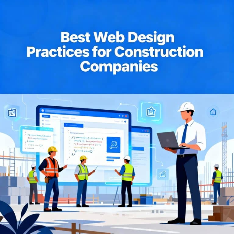
Statistics show that 38% of web designers cite outdated design as the biggest reason visitors leave a website. This makes construction website design trends critical for business survival.
Your construction company’s first impression now happens online rather than at job sites. The construction management software industry has grown to $10.64 billion. Mobile devices now account for 59.16% of website access. Users expect websites to load in two seconds and leave if pages take more than three seconds to display.
Companies that implement effective construction website design stand out from their competitors. Modern design trends have become vital to stimulate growth. The industry’s digital transformation continues to accelerate. About 82% of U.S. construction firms use AI strategies, and 46% of customers value testimonials as much as personal recommendations.
This guide presents the most impactful construction website design trends for 2026 that will help your company build a converting digital presence.
Breaking the Grid Layout
Traditional grid systems have shaped web design patterns through columns and rows for years. Breaking the grid layout has become one of the boldest construction website design trends for 2026. This approach frees sites from rigid structures while keeping them functional.
What breaking the grid layout is
Breaking the grid layout deliberately moves away from standard web design grid systems. Traditional layouts organize content in uniform columns and rows. In contrast, broken grid designs adjust column widths, vary row sizes, and let elements overlap. This creates unexpected visual patterns that still maintain structure.
The concept doesn’t abandon organization. Designers call it “organized chaos” a creative twist on design rules. Broken grid layouts create surprising yet cohesive visual experiences through asymmetry and strategic element placement.
These designs build on conventional structure rather than discarding grid concepts. They purposefully break guidelines to add visual interest. Think of it as a controlled rebellion where elements flow between columns or stretch beyond typical boundaries.
Why breaking the grid layout works for construction websites?
Construction company websites thrive with broken grid layouts. This approach shows both creativity and technical expertise. Standard layouts with predictable columns make websites look too similar. Construction firms that embrace asymmetry show their innovative thinking.
Broken grid layouts create visual hierarchies that guide visitors to key information naturally. Construction businesses can boost their engagement and conversion rates with this strategic approach.
The design helps construction websites stand out in their field. Construction companies can create memorable user experiences by challenging uniform grid-based websites. Users notice and remember key messages better because of the unpredictable layouts.
The practical benefits go beyond looks. Construction websites can showcase their signature projects through bold spacing and asymmetrical designs. This creative style proves that a company thinks differently exactly what clients want in construction partners.
How to implement breaking the grid layout?
A broken grid design starts with a standard grid system as its base. You can modify it through CSS or graphical interface tools. The key is starting with traditional structure before adding creative variations.
- Construction websites can use these specific techniques:
Change vertical alignment with asymmetrical element placement instead of strict left, right, or center alignment - Try layering elements to help visitors connect project images and text
- Place text or buttons inside image blocks to link related content while breaking traditional patterns
- Use strategic whitespace to highlight key content and signature projects
- Adjust standard spacing between columns to create unique visual flow
The best results come from mixing symmetrical and asymmetrical design elements. The site must stay functional and available on all devices even with irregular patterns.
Design experts suggest sketching ideas first or experimenting with established grid systems like 960. This gives you the structure needed to lift construction websites beyond typical designs.
Centered Logo Placement
Logo placement shapes how visitors notice construction companies online. Your logo’s position affects both the visual appeal and the way users behave on your site.
What centered logo placement is?
A centered logo sits in the middle of the website header and creates symmetry across the page. This design choice marks a big change from the years-old practice of putting logos on the left side. The centered approach takes inspiration from traditional newspaper mastheads with their central headers.
Mobile screens show little difference between left and center-aligned logos. Desktop displays tell a different story – the wider screen creates distinct user experiences based on where you put the logo. The centered position creates visual balance that flows from the middle.
Why centered logos are trending in construction web design?
Construction websites have embraced centered logos for specific industry reasons. These logos instantly create symmetry that shows balance and stability exactly what construction companies want to highlight. Companies known for design excellence often put their logos in the center to create balanced layouts across their sites.
The mobile-first design approach has pushed this trend forward. More clients now browse on phones, so construction companies need their brand to look good on all screens. Centered logos look consistent from phones to desktops without any shifts.
Over the last several years, post-COVID design has made designers rethink old rules. Centered logos offer a subtle change from tradition, unlike dramatic approaches such as brutalist layouts or extreme minimalism. Companies like Ujamaa Construction, Gallant, and Moriarty show how this works by keeping things clean and letting their images and messages stand out.
How to use centered logos effectively?
In spite of that, centered logos come with some challenges. Studies show users struggle six times more to find the homepage with centered logos compared to left-aligned ones. People expect to click logos in the top-left corner to go home it’s a habit that runs deep.
- Here’s how to make centered logos work on your construction website:
Add clear navigation options: Put a visible ‘Home’ link in your main menu since research shows users need it. Construction clients need clear paths through your services. - Test across all screen sizes: Centered logos look natural on phones but might confuse users on bigger screens where everything spreads out.
- Create visual balance: Keep your menus clear and make sure they don’t fight with the centered logo for attention.
Brand recall stays almost the same whether logos sit left or center. Things like contrast, spacing, and clarity affect how people remember your brand more than the logo’s position. This gives construction companies room to try centered designs while keeping their brand recognition strong.
Clear and Simple Navigation
Navigation is the foundation of effective construction website design. Many companies prioritize visuals but overlook this vital structural element. Poor navigation causes websites to lose up to 55% of visitors, which hits construction businesses hard when seeking new clients.
What clear navigation means in construction websites?
Clear navigation on construction websites creates a logical system of menus, links, and pathways that guide visitors through your content. Think of it as a roadmap that lets users move easily between different sections of your website.
Good navigation does more than just work it showcases your company’s capabilities right away. New visitors scan navigational elements first, with 38% looking at navigational links and layout during their initial visit.
Construction tech interfaces need simple navigation because workers access information in tough conditions. This calls for large buttons, minimal menus, and direct pathways that work in low light or with gloves on.
Why clear navigation improves user experience?
Research shows construction companies with clear navigation see lower bounce rates and keep visitors longer. This boosts conversion rates because potential clients who find your services, project galleries, and contact info easily become actual customers.
Good navigation lets users find information fast. Visitors stay longer and explore more when they can find what they need. This extra time creates chances to show off your expertise and completed work.
Search engines favor websites with clear, logical structures. Your site’s visibility in search results goes up with accessible navigation, which brings more potential clients to your construction business.
How to design intuitive navigation?
The most important content should come first when designing navigation for construction websites.
Your menu needs to highlight:
- Core services and portfolio – Put your main construction services and project galleries front and center in navigation
- Three-click rule – Critical information should be three clicks away at most
- Optimal menu size – Keep main navigation between 5-7 items since people remember about seven items at once
Construction company websites work best with navigation in standard spots usually across the top or down the left side on desktop views. Using the same layout on all pages builds trust and makes your site easier to use.
Complex projects and data can overwhelm users in the construction industry. Logical hierarchies with labeled icons and contextual cues help visitors find what they need. Keyboard navigation support makes the site accessible to users with disabilities.
A “Request a Quote” button in the top-right corner of navigation can boost conversions by a lot. The best construction websites use contrasting colors for these call-to-action buttons to create clear paths for interested clients.
Use of Colorful Gradients
Colorful gradients have stormed back into digital esthetics. They now add depth and dimension to construction website designs that once used flat colors. This visual technique has evolved from its 90s roots and become one of the most versatile elements in modern web design.
What colorful gradients are?
Gradients blend two or more colors smoothly and add depth and realism to flat design elements. These color combinations work like color “maps” that vary along a spectrum instead of using a single HEX code.
Construction websites use three main types:
Linear gradients blend colors in a straight line, moving horizontally, vertically, or diagonally
Radial gradients flow outward from a central point in a circular pattern
Conic gradients rotate around a center point to create a unique effect
Construction websites today employ gradients in their design elements from backgrounds and logos to text, buttons, and project photos. Each use helps break visual monotony while maintaining professionalism.
Why gradients boost modern construction website design?
Construction companies can use gradients to raise their plain color schemes. These vibrant visual experiences add depth to branding and help maintain industry credibility. A construction website can create dozens of gradient combinations with just two or three brand colors, which adds visual variety throughout the site.
Gradients catch visitors‘ eyes and direct them to specific website elements. Strategic placement can guide focus toward important information and create natural visual hierarchies that lead users through content. This approach works well to showcase signature construction projects or highlight essential service details.
The industry continues to embrace multicolor gradients and gradient meshes as we approach 2026. These offer more dimension and customization than typical linear gradients. Construction companies can now create distinctive visual identities that help them stand out from competitors.
How to apply gradients without compromising accessibility?
Accessibility should be your top priority when implementing gradients. The Web Content Accessibility Guidelines (WCAG) require a minimum contrast ratio of 4.5:1 between text and background. Construction websites need full testing to ensure their gradient backgrounds comply.
You should test the darkest text against the darkest background and the lightest text against the lightest background areas of your gradient. Note that your text must remain readable against every part of your gradient background.
Some gradients can create visual “vibration” that causes accessibility issues and might lower page rankings. You can fix problematic gradients with semi-transparent overlays, text shadows, or different text positioning.
Gradients offer great esthetic benefits but should boost rather than hurt the user experience. Construction websites can enjoy gradients‘ visual appeal while keeping their professional credibility and accessibility standards through careful implementation and testing.
Custom Photography and Visuals
Custom photography has become the cornerstone of compelling construction website design and a defining trend for 2026. Digital first impressions matter more than ever, and construction companies have found that authentic imagery creates immediate trust and drives conversions.
What custom photography means for construction websites?
Custom photography for construction websites captures professional, high-quality images unique to your specific projects, team members, and work processes. Your actual construction sites, completed projects, and team members at work are documented through custom photography, creating a visual record indexed by location and date.
This approach includes everything from single milestone shoots to regular interval documentation that shows transformation over time from groundbreaking to completion. Custom photography creates visual narratives that showcase each project’s progress and highlights your company’s capabilities through authentic visual storytelling.
Why custom visuals outperform stock images?
Stock images cannot match the authenticity that custom photography brings to construction websites. These images serve as a “digital handshake” when potential clients visit your website your first and often only chance to impress. Original photography builds instant credibility by showing real examples of your craftsmanship.
High-quality photos eliminate doubt in potential clients’ minds. They “stop the scroll” and let homeowners see what terms like “luxury remodels” or “custom landscaping” actually mean to your company. You also get exclusive rights to images no competitor can use, which helps your website stand out in a crowded marketplace.
Custom photography showcases critical qualities that build trust:
- Attention to detail in your work
- Modern equipment capabilities
- Efficiency of your processes
- Quality of architectural outcomes
How to capture and optimize custom visuals?
Success requires photographers with construction industry experience who understand both photography principles and construction site safety protocols. These professionals can navigate job sites without disrupting work flow.
Your team needs methodical organization of visual assets. Construction photos should be indexed by location and date, with stakeholders accessing them through secure cloud-based platforms. This system lets your team retrieve full photo records quickly from anywhere.
Professional photography showcases final projects best, while smartphone photos work better for casual updates. Key moments that tell your company’s story should be the focus when planning photography sessions from team members working on site to technologies in use and completed projects.
Your portfolio acts as a silent salesperson, so you should curate a focused gallery of your best projects and solutions. Your construction website’s visual content does more than document your work it communicates your brand’s values and capabilities better than words alone could.
Background and Featured Videos
Video content now leads the way in construction website design. Dynamic visuals have become vital for companies that want to stand out in the digital space. This approach works better than static content in every way.
What background and featured videos are?
Background videos play on their own behind text or other elements. They create subtle movement without needing users to do anything. These ambient animations keep running in loops and add visual interest while you retain focus on the main content.
Featured videos work differently as standalone pieces that users choose to watch, like project walkthroughs, testimonials, or process explanations.
Each video type serves a specific purpose on construction websites. Background videos set the mood and atmosphere. Featured videos give detailed information about specific projects or services. The biggest difference lies in how users interact background videos improve passive browsing while featured videos need active viewer participation.
Why videos increase engagement on construction websites?
The numbers tell a compelling story website visitors stay nowhere near 15 seconds on average, which makes quick engagement vital. Construction companies find videos exceptionally effective at keeping visitors longer, with 91% of consumers saying they want more video marketing from brands.
We found that videos showcase construction projects better than static images. They highlight scale, quality, and unique features. Time-lapse sequences work great in construction. They pack months of work into short, compelling content that shows your expertise right away. These visual stories let potential clients see your achievements step by step.
On top of that, people remember information from videos 95% better than other media forms. This improved information retention helps convert leads by building trust and transparency.
How to use videos without slowing down your site?
You need proper compression to optimize videos. Tools like FFmpeg can reduce file sizes while keeping visual quality intact. For videos that replace GIFs, remove audio tracks to make them smaller.
Other strategies that work well include:
Using the poster attribute with Intersection Observer API to download videos only when users scroll to them
- Having fallback images ready for devices with slower connections
- Putting videos on YouTube or Vimeo instead of embedding them directly
- Keeping background videos short 3-7 seconds for looping content works best to avoid performance issues
You should track performance metrics regularly. SEO tools like Semrush help you monitor how video integration affects page speed, SEO performance, and accessibility.
Micro-Animations and Motion Effects
Micro-animations turn static construction websites into lively digital experiences. These purposeful movements create visual interest that doesn’t overwhelm visitors. They have become a key feature of successful industry websites.
What micro-animations are?
Micro-animations bring website elements to life through subtle motion. These brief visual movements respond to user actions or system changes and create trigger-feedback pairs that make navigation better. Your construction portfolio becomes more interactive when these animations appear as users hover, click, or scroll.
Common types include:
Hover animations that highlight buttons, links, or project images when cursors pass over them
Feedback animations like button state changes that confirm user actions
Accent animations that add polish and personality through gentle movement
Loading indicators such as skeleton screens that display page outlines while content loads
These small touches make a big difference. They turn ordinary construction websites into memorable experiences that guide visitors naturally through content.
Why micro-animations improve interactivity?
Visual feedback from micro-animations makes construction websites more usable. Users stay involved with your portfolio and services through this confirmation loop. These animations direct attention to important information without overwhelming anyone an ideal way to highlight project galleries or explain services.
Loading indicators and progress bars make performance feel faster, which leads to better user satisfaction [100, 101]. Construction companies can show their personality through micro-animations while staying professional. Just like writing sets the tone, animations reveal character.
How to use animations subtly in construction website design?
Each micro-animation needs a clear purpose they shouldn’t exist just for decoration. Your construction website’s animations should focus on project galleries, service processes, or guiding users to contact information.
Here’s how to implement them well:
Make sure animations work on all devices since construction clients often check websites from phones at job sites
Keep animations short most effects should last less than half a second
Skip “visual bullying” where random movements distract users
Before finalizing, ask yourself “Does this movement make my interface clearer?”
Micro-animations show attention to detail exactly what clients want in construction partners. Thoughtful implementation proves your company brings the same precision and care to building projects.
Minimalist Design Approach
Modern digital experiences now rely on minimalist construction websites. These websites strip designs to their basics while keeping them functional and visually appealing.
What minimalist design means in construction websites
A minimalist design makes website interfaces simpler by taking out extra elements and focusing on what matters most. This clean, uncluttered approach ensures every detail has a purpose. Simple layouts with plenty of whitespace make text 20% more readable than complex ones. The concept goes beyond just looks and shows an environmentally responsible way to present your digital brand.
Why minimalism enhances clarity and professionalism?
Clean and simple designs help visitors focus better on what matters. Your clients can find information easily because there’s less to distract them. The whitespace acts like a natural divider between different sections. Pages load faster too since they have fewer elements – a vital feature since most users expect websites to respond within two seconds.
How to implement minimalism without losing impact?
Start with content prioritization to bring minimalism to your site:
- Pick elements that truly support your main message and features
- Stick to a few colors with one bold shade for action buttons
- Add warmth through images of natural materials
- Make your layout spaces serve multiple purposes
Note that good minimalism doesn’t mean cutting content randomly it means showing information in the clearest way possible.
Social Proof and Testimonials
Trust signals are vital in modern construction website design. Social proof helps potential clients make decisions when they evaluate companies online.
What social proof is in website design?
Construction website design uses social proof to showcase customer feedback through reviews, testimonials, case studies, star ratings, and accreditations. These elements help build credibility with potential clients who need reassurance before they invest thousands or millions in construction projects. Third-party validation proves your company delivers on its promises.
Why testimonials build trust for construction companies?
Research shows 91% of homeowners check online reviews and ratings right after looking at prices. About 81% of consumers need to trust a brand before buying. This validation creates a strong effect because people trust other customers‘ opinions more than company-generated content. Testimonials serve as digital word-of-mouth effectively – 84% of consumers trust online reviews as much as personal recommendations.
How to display testimonials effectively?
Your website needs testimonials placed strategically across different pages instead of grouping them in one place. Specific feedback about project details, challenges solved, and measurable results works better than general praise. Testimonials become more credible when they include full names, project details, and locations. Your homepage, service pages, and case studies should feature testimonials to build trust consistently throughout the user’s experience.
Bold Brand Messaging
Compelling messages are the foundations of construction websites that work in 2026. Your brand statements need to connect instantly with clients who might hire you.
What bold brand messaging is?
Smart language builds your construction company’s unique identity. It lines up with your values and talks directly to your target audience. Your message should go beyond basic construction slogans. It needs to showcase your positive attitude and what you can do. Your brand’s voice becomes your personality that shows your value and vision to future clients.
Why strong messaging matters in construction website design?
First impressions last when clients visit a well-designed website with clear messages. The construction industry knows good communication is vital. Research shows companies with consistent branding make 33% more revenue than their inconsistent competitors. It also helps tell your brand’s story in a personal way. This makes clients feel understood while addressing what they want and need.
How to craft and place bold messages on your site?
You need a full picture of your audience first. Next, develop a voice that matches your construction company’s character and stays consistent.
We focused on:
- Messages that solve client problems by showing clear benefits
- Bold statements on your homepage that grab attention right away
- Simple yet powerful structure focused on what matters most
A catchy tagline sticks in people’s minds off the top of their head when they think about your brand like Nike’s “just do it”.
Conclusion
These ten construction website design trends for 2026 strike a perfect balance of looks and performance. Each trend will give a unique advantage that can lift your construction company’s online presence by a lot. You might find it challenging to use all these elements at once. Breaking grid layouts creates visual interest without losing structure. Centered logos create visual balance, and clear navigation helps visitors find information fast.
Colorful gradients, custom photography, and well-placed videos come together to create memorable experiences that showcase your projects in the best light. The site becomes more interactive with micro-animations, while minimalist design removes distracting clutter for potential clients.
Social proof remains crucial since most clients read reviews before they decide. Bold brand messaging communicates your value right away. These trends work together to build websites that look professional and turn visitors into clients.
Your construction website works as your digital storefront it’s often the first thing potential clients see about your business. Many construction companies have boosted their conversion rates by using these design principles. Those who need professional help with construction websites can find specialized resources to implement these trends.
The construction industry keeps changing. Yet one fact stays true websites that balance visual appeal with clear information will beat their competition. Companies that accept new ideas while staying true to their voice will see more engagement, higher conversion rates and end up with more successful projects.
About the author

Nicholas Robb, Founder
The original Design Hero founder, solopreneur and marketing expert; Nick will help you supercharge your business success with a broad skill-set spanning a range of digital marketing fields.
If you want help growing your business